Sometimes, we take for granted that not everyone is in our industry and knows all of the building and design jargon we use on a daily basis. As a result, we will occasionally take opportunities to clarify and share some of that knowledge and show our process in an effort to help you in your own home building and remodeling journeys.
As you may remember, in an earlier post we shared the kitchen layout 'plan view' that was done in AutoCAD by Autodesk®. A plan view is a two-dimensional (2D) drawing that shows a section from the top - as if you're looking down into the kitchen. These drawings are useful for communicating building instructions.
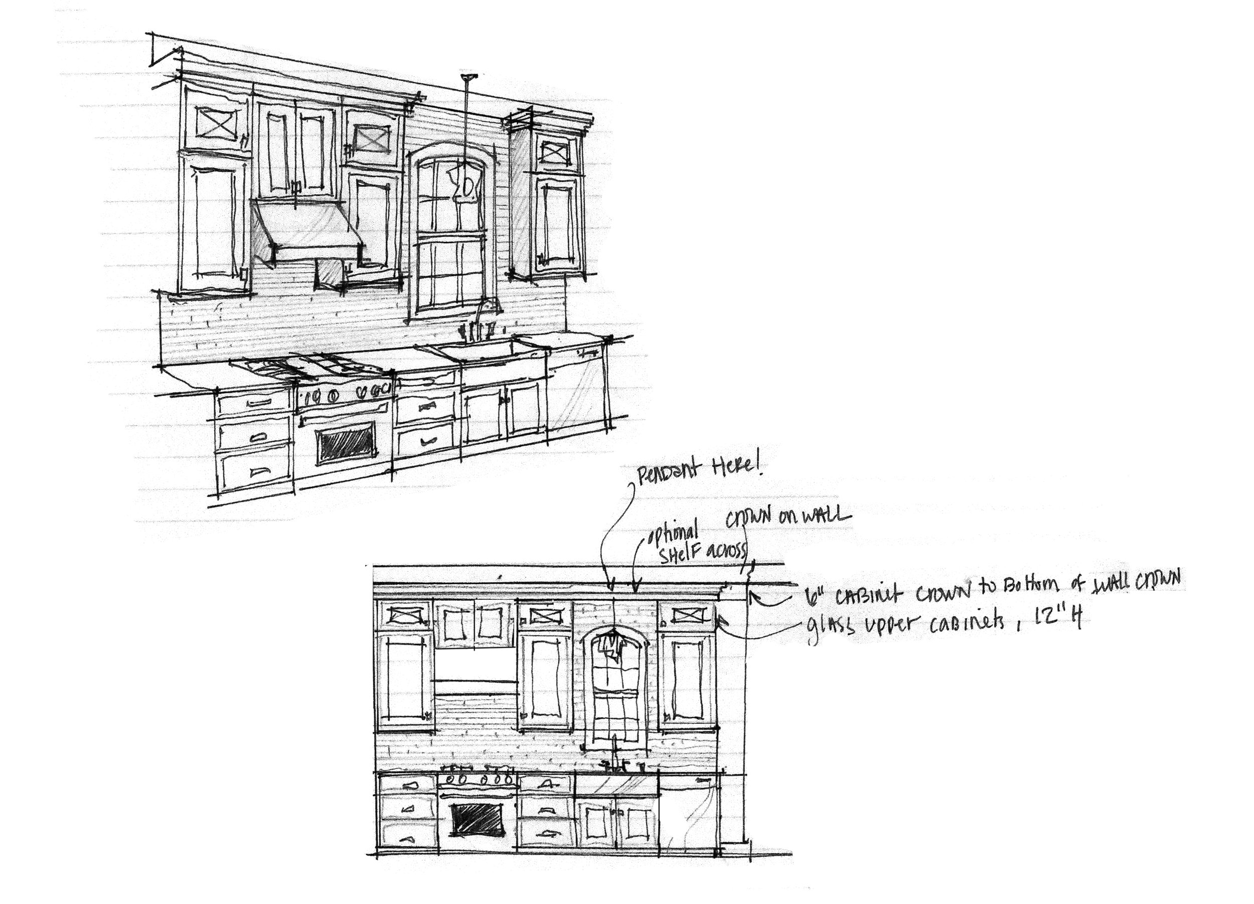
As part of the design process, those 2-D drawings of the kitchen layout were then used to create 3-D drawings and renderings. Below is a drawing done in 3-D.
A 3-D sketch and an elevation drawing
Taking this a step further, we then had the space created in a software called Chief Architect®. Having an image of the full whole room done in 3-D helps us to grasp the space, proportion, and flow of the kitchen and surrounding areas.
A 3-D rendering of the kitchen
While this image is extremely helpful for understanding the space, the software is limited in the types of materials that you display so we modified it once again in Adobe Photoshop to include the potential finishes, furniture, and accessories we have in mind. This image gets me closer to a realistic sense for the color, contrast, and style. It allows me to visualize how the selections relate to each other.
A 3-D rendering using specific finishes
What a difference! The styled rendering looks amazing. We can actually visualize ourselves in the space with this view AND appreciate the style of the space.
The flooring and cabinets are set, however, we are still working to find just the right lighting, furniture, backsplash, countertop, and fixtures. Below are some details that we're considering.
Mixing metal finishes is currently on-trend. While mixing metals allows for a more interesting design, it is more challenging. In order to be successful, it is important to consider the design principles repetition and balance. The brass, black and nickle finishes are all being considered because the colors and finishes will be repeated in other elements of the room. The color of the brass is being repeated in the art. The nickel is being repeated in the stainless appliances. The black is being repeated in the island stain color, door knobs, and hallway lighting. Making sure the placement of those repeated finishes is balanced or placed evenly, ensures a successful design.
Our process continues as we sort through all of the options looking for the best combination. We look forward to sharing our final selections with you soon.
The sketches and styled rendering were done by Angie's design collaborator, Lindsey. The Chief Architect® rendering was done by Angie's design collaborator, Laura. Angie loves her talented design team.
The front of the house is taking shape
A view from the back.


