As we were laying out our floor plan and looking at our wants and needs we had to ask ourselves these questions. How many baths should we include on our main level? What is typical? What is needed? What is preferred?
The current trend in residential construction for homes our size is to have a minimum of:
A full master bath
A full main bath
A powder room
In the house we're currently living in, we have 1 full bath and 1 tiny powder room (seriously, it’s small!). We've been living here for 17 years. For us, adding another full bath is going to be pure luxury. We’re SO looking forward to the efficiency that will come with having an additional shower in the house.
With that said, we decided that the second full bath on the main floor will also be used by guests. No powder room on the main floor for this family. This change will allow us to use that square footage in better ways, as well as spend a little bit more on both bathrooms with some upgraded fixtures and tile.
The practicality discussion is over (you know we like to be practical) - now on to the fun stuff!
Let’s start with a little architectural inspiration from Houzz. The use of a half wall, or pony wall, to separate the vanity and stool is a common feature in bathrooms. It hides the stool and puts the focus on the prettier things like the vanity, light, mirror, countertop, and faucet.
The design in this photo from Fluidesign Studio takes that half wall a step further with a cased opening up and around the half wall. Since we have a planned ceiling height of 9’ in the bathroom, this feature will work for our house! We’re excited for the architectural detail this will add to the room. In fact, we like it so much, we decided to add it in the master bathroom, too.
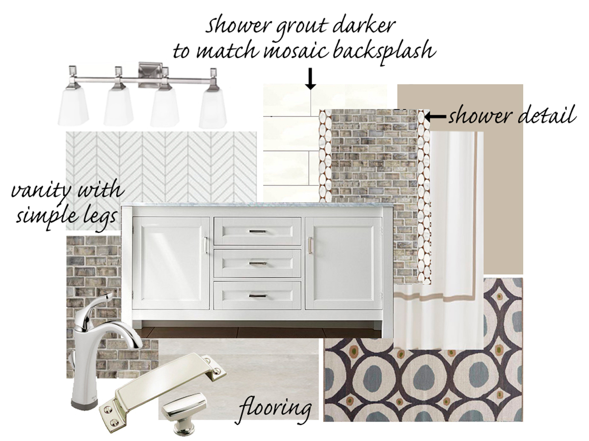
On to the tile, lighting, vanity, and wallpaper. While the accent tile has an iridescent quality to it and the rug is a fun modern pattern, the majority of the materials we selected are neutral and classic. A chrome finish on the light, faucet, and cabinet pulls will unify the different elements and add a little sparkle.
You may have noticed that I said wallpaper. (Gasp!) It's not the wall treatment dujour, but it can add so much interest to a room. One tiny, itty bitty wall in the main bathroom is going to receive the wallpaper treatment.
ProTip Wallpaper adds pattern and texture to a room. This can be done very subtly with a woven natural wallpaper like grasscloth, or boldly with a high contrast print. Luckily, these stylish, modern wallpapers are far easier to remove than the ones of our childhood, too. Below are 4 different examples.
After an extensive search for the perfect paper, we landed on two options.
OPTION 1
A wallpaper by York with a really interesting metallic sparkle to it. The pattern is also very geometric and modern. While we really like both, we decided on option one. We feel that this pattern is a better fit for the main bath.
While the countertop and floor are mainly grey, the wallpaper, paint color, and accent tile work together to add the warmth of a bone or beige color. With our bend towards neutral design, pattern and texture create additional elements to appeal to the senses - making the space classic, not boring. We love what the accent tile, rug, and wallpaper bring to the space.
ProTip Speaking of neutrals, while grey still has a strong presence in current design trends, adding some warmth to balance the grey is a beautiful combination. Design lingo for a "warm" grey or a mix of beige and grey is often called greige.
Visit our Shop our House page for more links to the items we have selected!
With our cold Wisconsin winter, there have been a few changes to our schedule. Fortunately, our building team has been able to keep things on track. Estimated completion is planned for early May.
A view of the kitchen and pantry walls
One step closer to a finished space
We're still making frequent stops at our house to check on progress and work out details. Our priority is to get all of our selections made and orders placed. It's been a busy and stressful time but also very exciting!


