We live in Wisconsin where there are very few weeks during the year where outside dining (and sometimes sitting) is comfortable. Instead of lions, tigers and bears, there are mosquitoes, flies, and bees. Oh my!
Even with the pesky visitors, outdoor living is awesome! Nothing beats grilling out with a cold beer on a warm summer day.
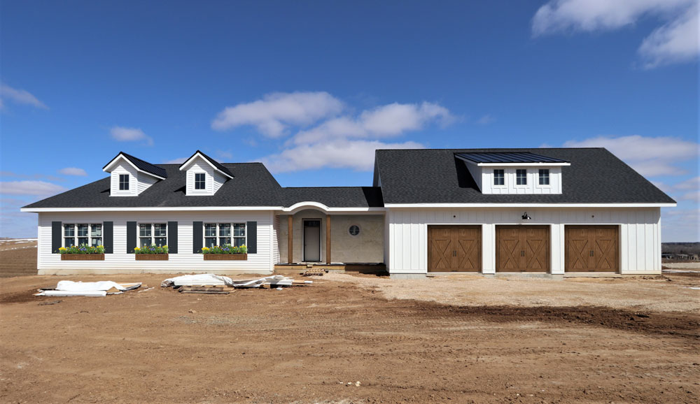
When designing the house, we thought about how these outdoor spaces relate to the indoors. We put the grilling patio near the kitchen. In fact, the kitchen sink is on the other side of that window with the arch top - only 5-ish steps away from the patio. Then we added the screen porch on the other side. Perfect for bug-free dining and lounging. All in, these two areas seat 12 people comfortably with room for extra chairs to be brought in.
We actually love how the patio is tucked away instead of out in the open. We also love that putting the screen porch on the side of the house instead of the back allows for a better view from the dining room.
Besides dining, we also wanted the screen porch to accommodate some lounge furniture. The result is a comfortable mix of dining and lounging with some additional floor space to accommodate larger groups when needed.
Like many of our rooms, it could use a few more decorations but we're keeping things simple for now and loving the extra space.
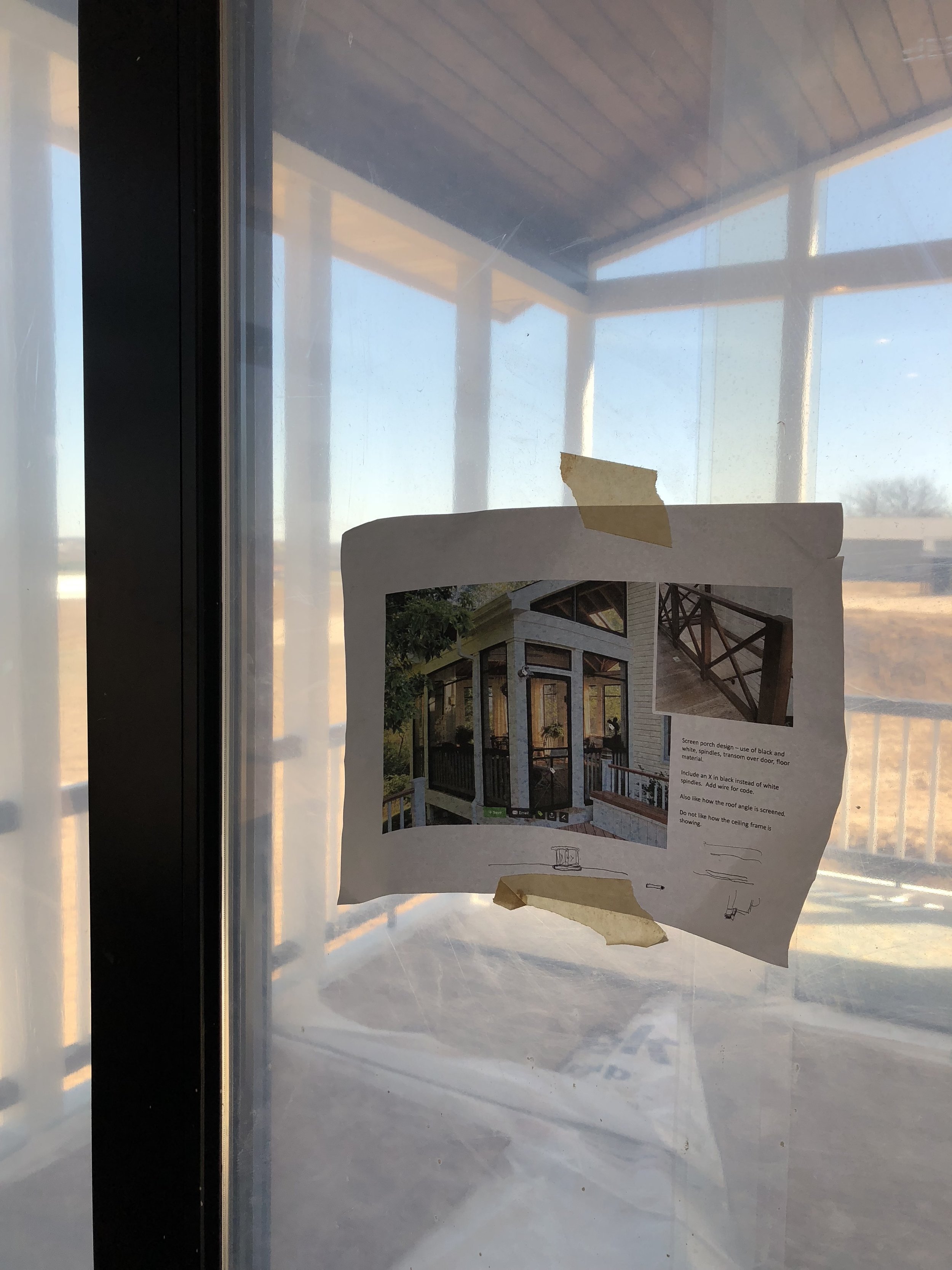
This is a view of our inspiration photo from houzz. It’s nice to have photos like this to reference when construction is happening.
Check out the Shop Our House page to learn more about the products and finishes we selected for our outdoor living.


