Sharing the 7 Principles of Interior Design
Read More#36 Window Box Planters
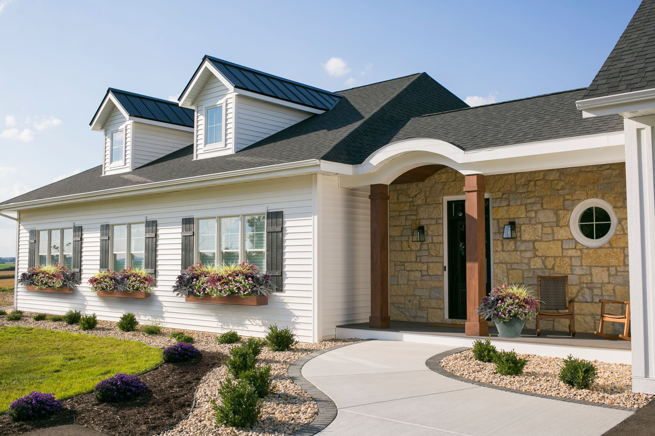
This warmer weather has us thinking that spring might be here to stay. Or is it too soon to put away the snow shovel? It really is hard to know what Mother Nature will send your way when you live in Wisconsin. Nonetheless, we are crossing our fingers and hoping for spring, mostly so we can start designing our flower boxes!
We created a Pinterest board with our favorite flower box ideas and color palettes. You can take a look at it to get some inspiration for your own home, and to see what we are loving this year.
A wonderful mix repeating the purple from the sage
A more formal approach with pops of red
An informal mix of purple and magenta
A brighter choice with magenta
We are torn between a whimsical and natural looking “wild flower” assortment, and a more-tailored arrangement of blooms. We think we have a favorite, but we are hoping to hear from our followers on which look they like the best. You can head over to our Instagram page to help us decide!
It is really reassuring that we can change the look of our landscaping up each year so we don’t need to stress out about permanence. Whatever we end up with, we will make sure to repeat the floral groupings at the front porch in a planter, to balance the home and to carry over the colors and texture of the botanicals from our window boxes. This is a fun project that we looking forward to taking on in the next few weeks. Here’s hoping for spring!
#30 Outdoor Living
We live in Wisconsin where there are very few weeks during the year where outside dining (and sometimes sitting) is comfortable. Instead of lions, tigers and bears, there are mosquitoes, flies, and bees. Oh my!
Even with the pesky visitors, outdoor living is awesome! Nothing beats grilling out with a cold beer on a warm summer day.
When designing the house, we thought about how these outdoor spaces relate to the indoors. We put the grilling patio near the kitchen. In fact, the kitchen sink is on the other side of that window with the arch top - only 5-ish steps away from the patio. Then we added the screen porch on the other side. Perfect for bug-free dining and lounging. All in, these two areas seat 12 people comfortably with room for extra chairs to be brought in.
We actually love how the patio is tucked away instead of out in the open. We also love that putting the screen porch on the side of the house instead of the back allows for a better view from the dining room.
Besides dining, we also wanted the screen porch to accommodate some lounge furniture. The result is a comfortable mix of dining and lounging with some additional floor space to accommodate larger groups when needed.
Like many of our rooms, it could use a few more decorations but we're keeping things simple for now and loving the extra space.
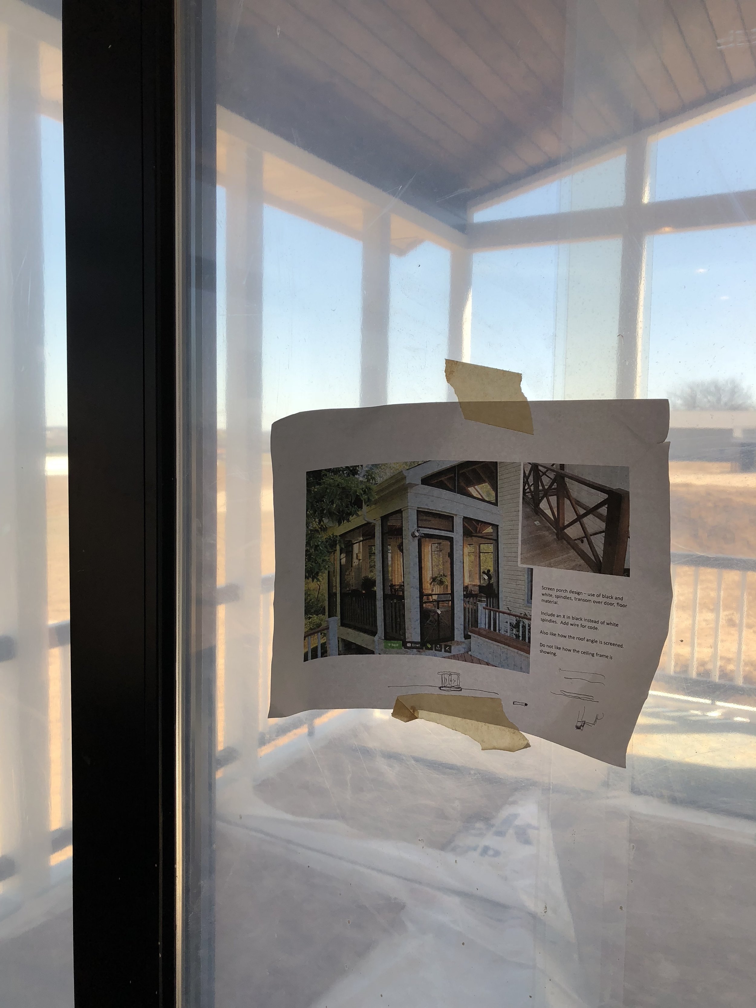
This is a view of our inspiration photo from houzz. It’s nice to have photos like this to reference when construction is happening.
Check out the Shop Our House page to learn more about the products and finishes we selected for our outdoor living.
#20 Exterior Details
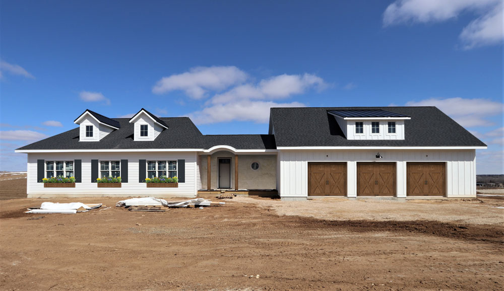
We're getting down to adding the final details to the exterior. One of the many decisions we need to make yet involves the flower boxes planned for under the windows. Should the color be black or brown?
My designer instincts are leaning me towards repeating the brown from the garage doors in order to create balance. We are considering black as well because of the continuity it would have with the shutters. The brown can be brought in with a fence or landscape. We had some images made of the options to confirm.
A view of the final selections
And the winner is...
After looking things over, we decided to stick with the brown. We really like how the brown adds warmth to the white and black. It also adds a touch of rustic which we like very much. we can't wait to see that pink wall by the front door turn to stone in the next week or two.
Are you following us on Instagram?
If you're on Instagram, make sure you follow along on our journey! We're making some serious progress on the house and posting lots of new photos!
#10 Circle Window
On the other side of that beautiful circle window our daughter dreamed up is the mudroom. Below is a conceptual sketch by my design collaborator, Lindsey, showing a brilliant idea for built-ins around that circle window.
Can pretty be used to describe a hard-working mudroom? We think so.
Conceptual sketch
After days of working out the details based on this concept, we placed the doors, walls, columns, and built-ins (both on the interior and exterior) so that things are centered and properly proportioned. We are really excited to see this built and installed!
The windows are in!
The dormers are in too!


