Sharing the 7 Principles of Interior Design
Read More#36 Window Box Planters
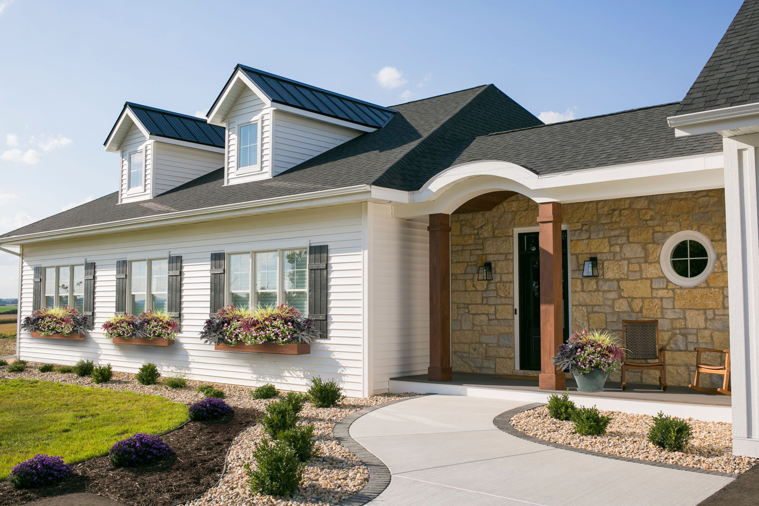
This warmer weather has us thinking that spring might be here to stay. Or is it too soon to put away the snow shovel? It really is hard to know what Mother Nature will send your way when you live in Wisconsin. Nonetheless, we are crossing our fingers and hoping for spring, mostly so we can start designing our flower boxes!
We created a Pinterest board with our favorite flower box ideas and color palettes. You can take a look at it to get some inspiration for your own home, and to see what we are loving this year.
A wonderful mix repeating the purple from the sage
A more formal approach with pops of red
An informal mix of purple and magenta
A brighter choice with magenta
We are torn between a whimsical and natural looking “wild flower” assortment, and a more-tailored arrangement of blooms. We think we have a favorite, but we are hoping to hear from our followers on which look they like the best. You can head over to our Instagram page to help us decide!
It is really reassuring that we can change the look of our landscaping up each year so we don’t need to stress out about permanence. Whatever we end up with, we will make sure to repeat the floral groupings at the front porch in a planter, to balance the home and to carry over the colors and texture of the botanicals from our window boxes. This is a fun project that we looking forward to taking on in the next few weeks. Here’s hoping for spring!
#30 Outdoor Living
We live in Wisconsin where there are very few weeks during the year where outside dining (and sometimes sitting) is comfortable. Instead of lions, tigers and bears, there are mosquitoes, flies, and bees. Oh my!
Even with the pesky visitors, outdoor living is awesome! Nothing beats grilling out with a cold beer on a warm summer day.
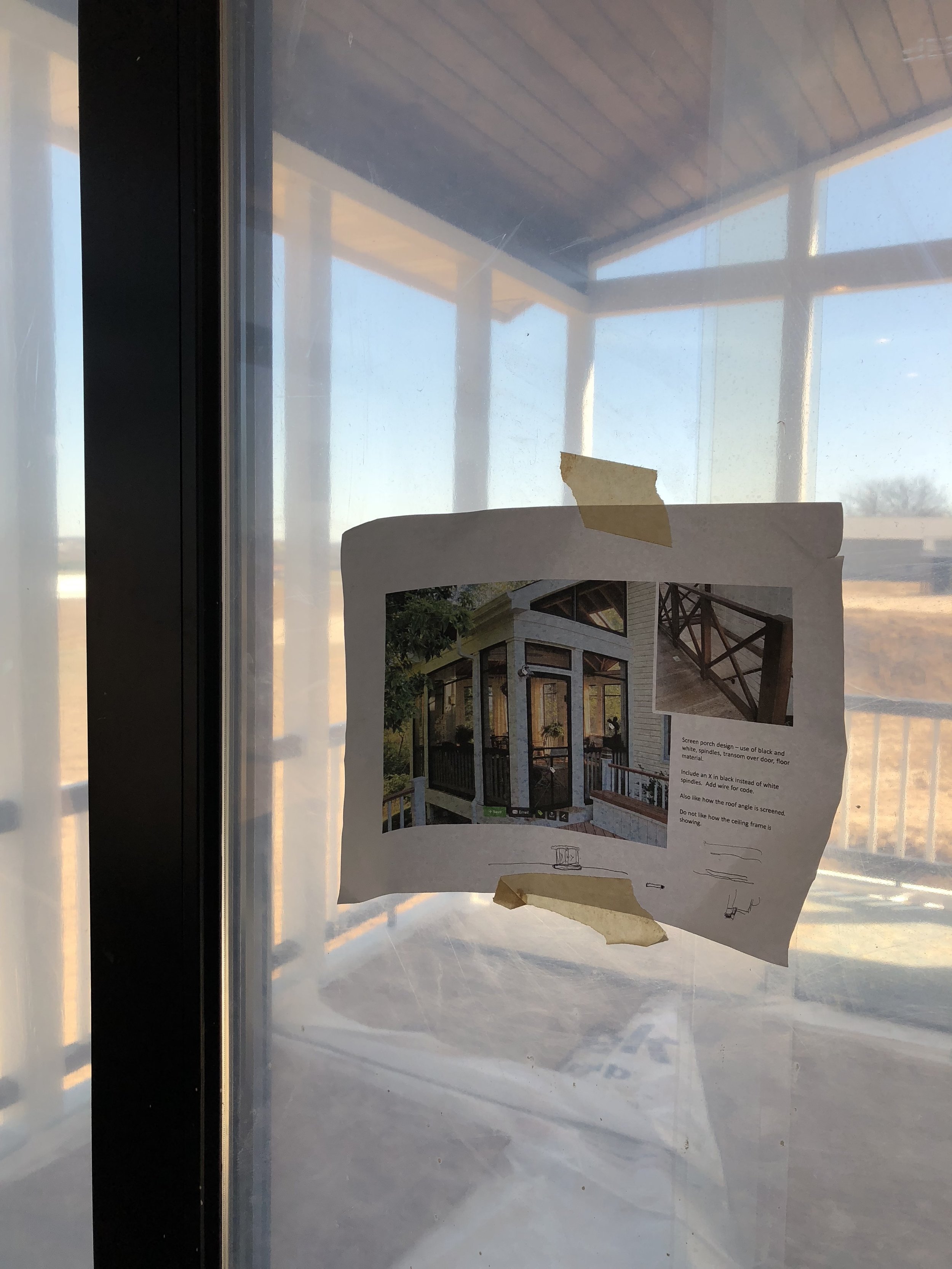
When designing the house, we thought about how these outdoor spaces relate to the indoors. We put the grilling patio near the kitchen. In fact, the kitchen sink is on the other side of that window with the arch top - only 5-ish steps away from the patio. Then we added the screen porch on the other side. Perfect for bug-free dining and lounging. All in, these two areas seat 12 people comfortably with room for extra chairs to be brought in.
We actually love how the patio is tucked away instead of out in the open. We also love that putting the screen porch on the side of the house instead of the back allows for a better view from the dining room.
Besides dining, we also wanted the screen porch to accommodate some lounge furniture. The result is a comfortable mix of dining and lounging with some additional floor space to accommodate larger groups when needed.
Like many of our rooms, it could use a few more decorations but we're keeping things simple for now and loving the extra space.
This is a view of our inspiration photo from houzz. It’s nice to have photos like this to reference when construction is happening.
Check out the Shop Our House page to learn more about the products and finishes we selected for our outdoor living.
#20 Exterior Details
We're getting down to adding the final details to the exterior. One of the many decisions we need to make yet involves the flower boxes planned for under the windows. Should the color be black or brown?
My designer instincts are leaning me towards repeating the brown from the garage doors in order to create balance. We are considering black as well because of the continuity it would have with the shutters. The brown can be brought in with a fence or landscape. We had some images made of the options to confirm.
A view of the final selections
And the winner is...
After looking things over, we decided to stick with the brown. We really like how the brown adds warmth to the white and black. It also adds a touch of rustic which we like very much. we can't wait to see that pink wall by the front door turn to stone in the next week or two.
Are you following us on Instagram?
If you're on Instagram, make sure you follow along on our journey! We're making some serious progress on the house and posting lots of new photos!
#8 Architectural Elevations
Back in post #4 we shared our daughter's house plan. If you squint really hard at this elevation drawing, you can see the porthole for the submarine she drew. Or, maybe it's just a really cool round window pouring light into our mudroom.
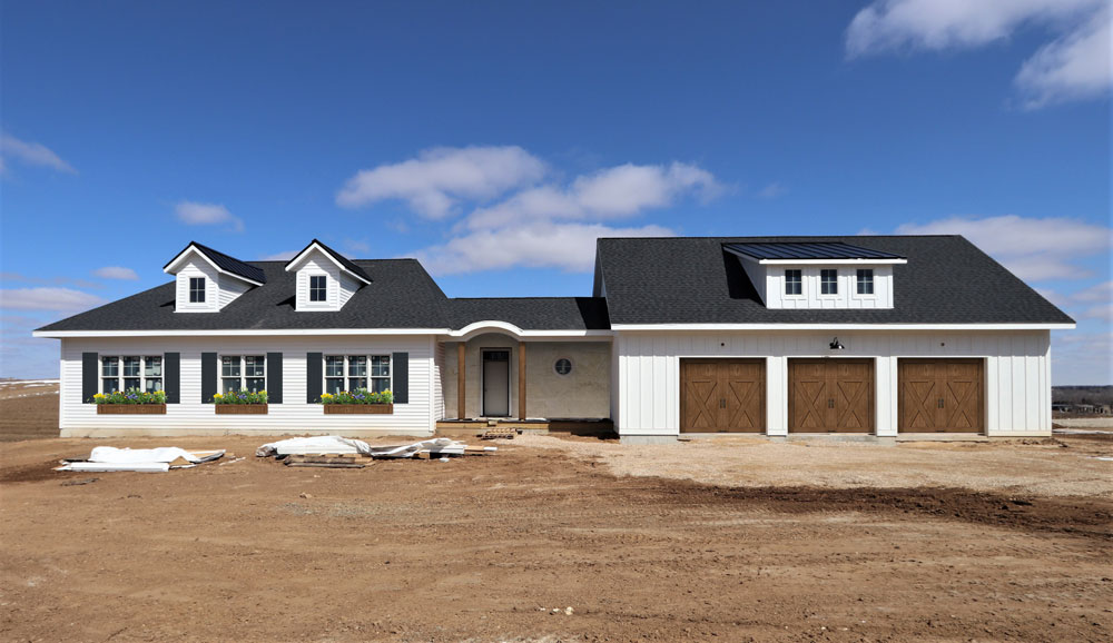
It was extremely important to us that we had clean roof lines on our new home, we love good curb appeal. We used the dormers (windows projecting from the roof) over the garage and house to break up each roof and we used a barrel arch over our front door to create a unique entry area. We absolutely love how it looks.
Angie worked tirelessly with the architect to make sure that the top roof line of the house and the garage were at exactly the same height and, from the front of the house, the roof over the entry hides the roof over the screen porch. If you run a vertical line through the center of the garage or house, you have two equal halves. Symmetry is really important to our vision, as it adds a sense of order and feeling of ease. The outer design gives us some major curb appeal and we couldn't be happier with the view from the road!
Front Elevation
Rear Elevation
On the back side, we have an incredible view that stretches out over miles and miles. We needed to make sure that when an opportunity to sit back and relax presented itself, we could truly enjoy the view. The large windows and screen porch offer many spaces and opportunities to relish the endless view.
Though it may seem obvious - We can't wait to get into this place! Talking about it gets us excited, each and every time!
Happy new year to you and yours and here's to a fabulous 2018 for all of us!
#2 Architectural Style
After settling on a location, we started looking for inspiration for both the design and style of our future home. We pulled inspiration from our community, the site itself, and from our own experiences. We looked at roof lines, doors, windows, shutters, stone, siding, and so much more! We often found ourselves interested in simple lines and neutral colors. This love for simplicity as well as the country location lead us to this farmhouse style. Below is a curated collection of images to inspire the selection of exterior colors and materials.
We started with crisp white windows and siding. We added black in the roof, door, and shutters for high contrast. The roof will be a combination of metal and asphalt shingles. To warm things up a bit, brown will be used for the garage doors, flower boxes, and pillars on the front porch. Stone with just the right texture will serve as the focal point around the entrance to our home.
The moods these images evoke for us are comfort and simplicity. For us, home is a place for connection. It is the place that we escape to at the end of our work days and a place where we embrace the love and laughter of our friends and family. We want our home to encourage informality and authenticity. We want visitors to feel welcome and at-home.


