Living Room - Where we Shop

Thank you to all of our readers that have sent in questions wondering…WHERE DO YOU SHOP? This is a series of posts listing many of the purchases broken up by room. We started with the master bedroom and bathroom and now we’re moving on to the living room.

At the bottom of the post are images of some of the items you see in the pictures. Just click on the image to learn more about each product. We hope our design ideas inspire your purchases. Happy Shopping!

Similar products are listed if products are no longer available. See disclaimer for information about affiliate links.

180914_AngieSchwabInteriors_0177.JPG

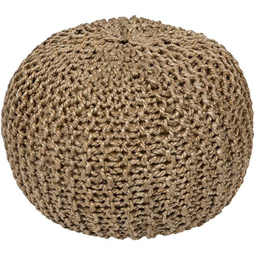
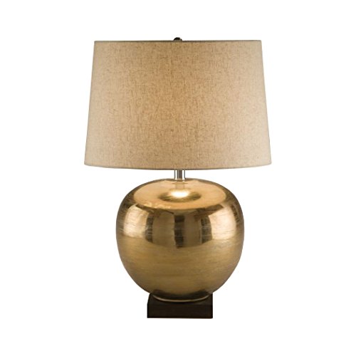
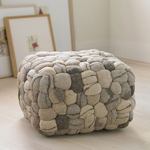
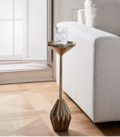
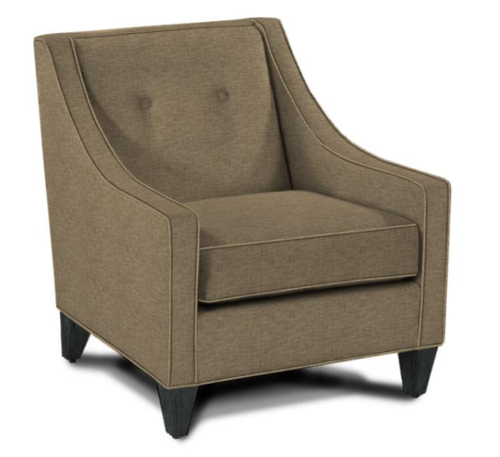
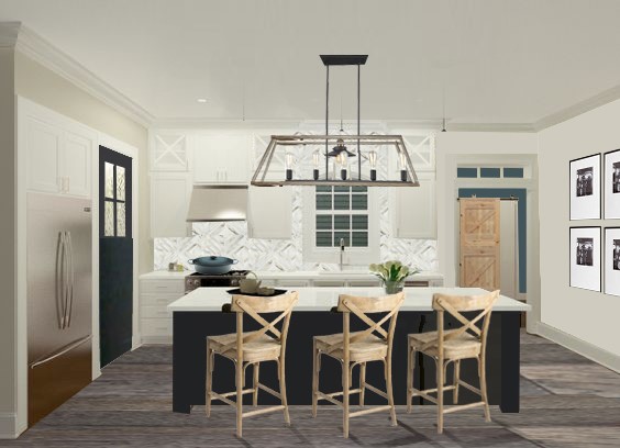
With no formal and informal living space, we wanted this room to feel inviting and relaxed, but, in a tailored way. All of the upholstered pieces are from Rowe Furniture and feature custom fabrics in neutral colors with subtle textures. The ottoman has a black and white hounds tooth pattern. The side table is from Wayfair and came unfinished so that we could stain it to match the kitchen island. A cute Art Deco style drink table in gold serves its purpose without taking up too much space.

180914_AngieSchwabInteriors_0200.JPG

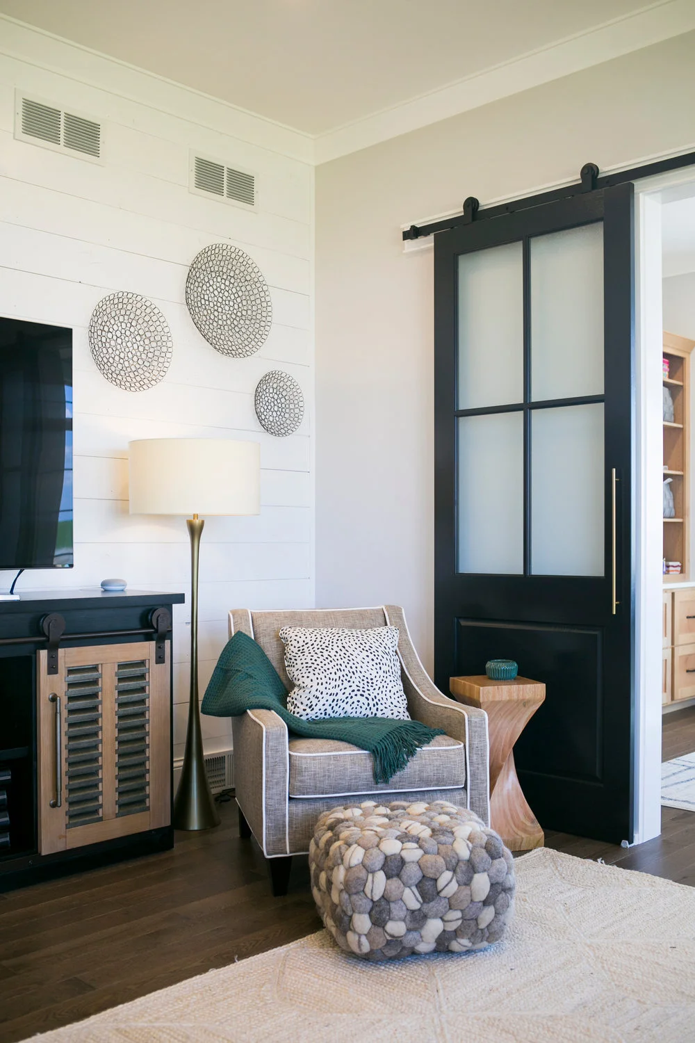
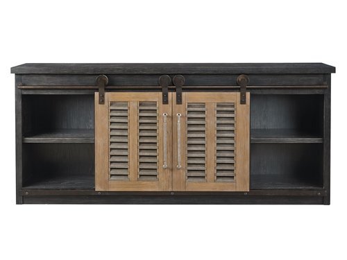
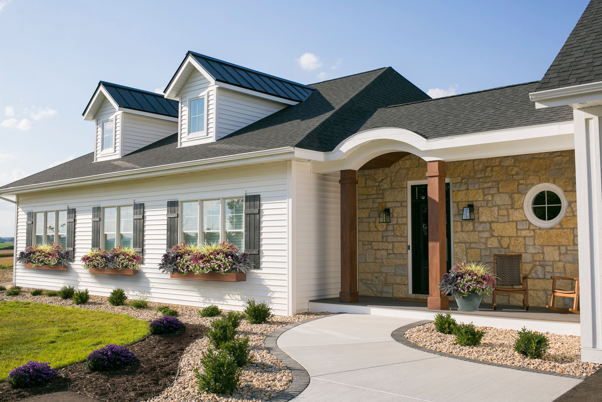
The paint color we used on the walls throughout the main areas is called First Star. It’s light and bright, but still has some contrast with the white trim. The trim color is called High Reflective White. The barn doors are painted Black Magic. All paint colors are by Sherwin Williams.

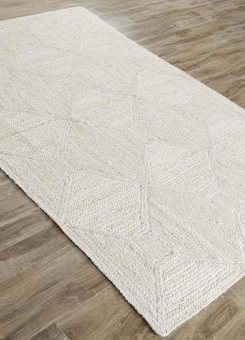
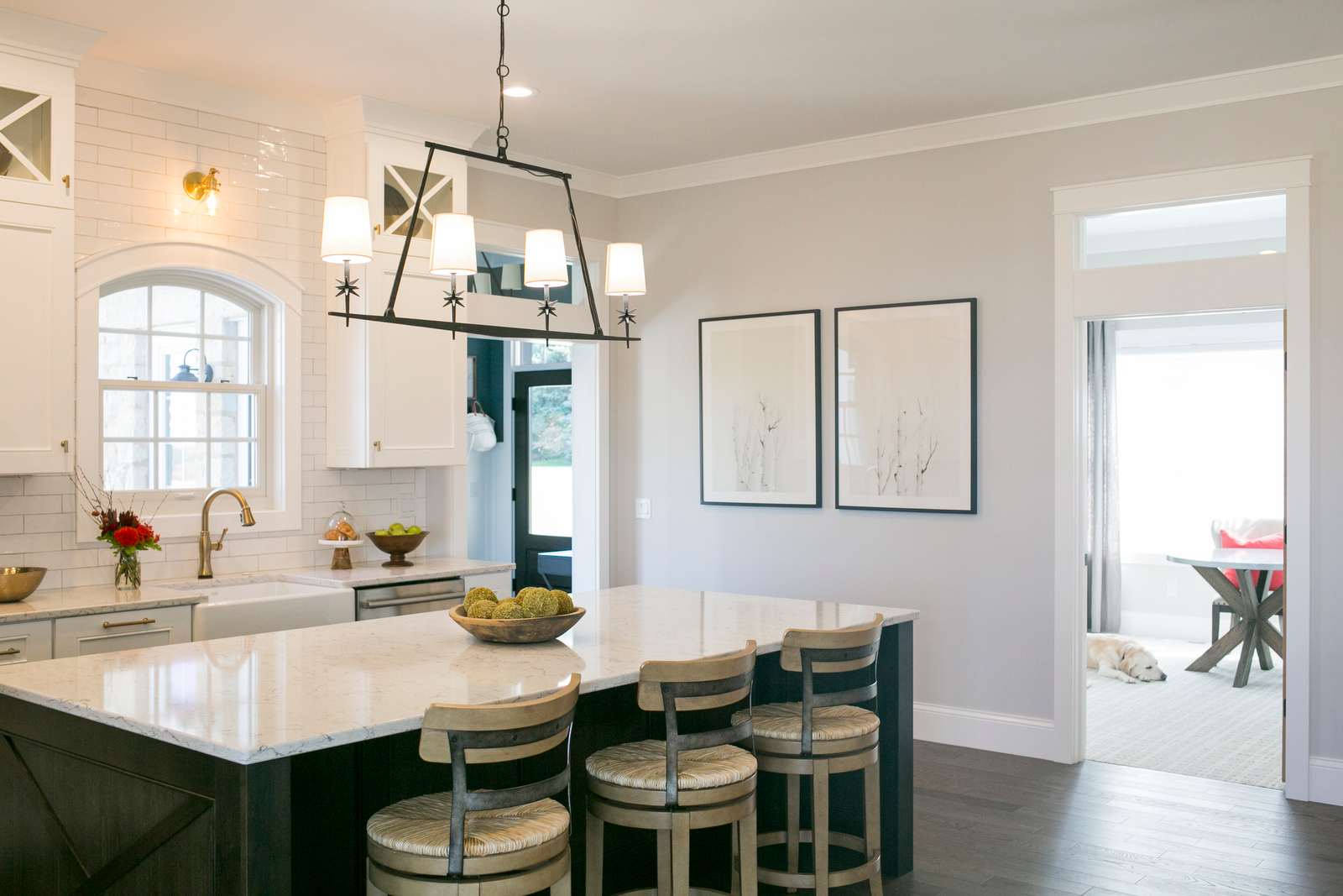
The wood flooring throughout the first floor is 3/4” thick solid red oak by Lauzon and it’s provided by H&R Carpets & Flooring. This post has a video that describes the wonderful air filtering benefits to this smart floor. Almost two years later, we couldn’t be happier with this choice!


#36 Window Box Planters

This warmer weather has us thinking that spring might be here to stay. Or is it too soon to put away the snow shovel? It really is hard to know what Mother Nature will send your way when you live in Wisconsin. Nonetheless, we are crossing our fingers and hoping for spring, mostly so we can start designing our flower boxes!

We created a Pinterest board with our favorite flower box ideas and color palettes. You can take a look at it to get some inspiration for your own home, and to see what we are loving this year.

A wonderful mix repeating the purple from the sage

A wonderful mix repeating the purple from the sage

A more formal approach with pops of red

A more formal approach with pops of red

An informal mix of purple and magenta

An informal mix of purple and magenta

A brighter choice with magenta

A brighter choice with magenta

We are torn between a whimsical and natural looking “wild flower” assortment, and a more-tailored arrangement of blooms. We think we have a favorite, but we are hoping to hear from our followers on which look they like the best. You can head over to our Instagram page to help us decide!

It is really reassuring that we can change the look of our landscaping up each year so we don’t need to stress out about permanence.  Whatever we end up with, we will make sure to repeat the floral groupings at the front porch in a planter, to balance the home and to carry over the colors and texture of the botanicals from our window boxes. This is a fun project that we looking forward to taking on in the next few weeks.  Here’s hoping for spring!

#33 Tech to simplify our day

Automated Faucets

1. We automated the faucets with this motion or touch technology from Delta Faucets. It keeps the countertops clean from dripping hands and it keeps faucets clean from dirty fingers. Oh, and it makes the necessary yet mundane things like washing hands go faster. It even has an LED light that indicates the water temperature. We have these faucets in the main bathroom, the master bathroom, and in the kitchen.

Automated Blinds

2. We automated the blinds with PowerView and SoftTouch technology from Hunter Douglas. With a quick tap on the wand or a click on the remote, the blind moves in place while you walk away. Once again, a twice-daily task is faster making our day more efficient and our outlook (literally) sunnier.

Automated Garbage Bin

3. We automated the garbage cabinet with servo drive technology from Blum. With a gentle push on the handle or the door, the garbage pops out at me. Our first thought was to keep the cabinet in good shape but having the ability to open this cabinet hands free is awesome (like when I just cracked an egg)! It’s another small way to make daily tasks more efficient.

Automated Lighting

4. We automated the lighting with motion sensors. More often than not, my hands are full when I'm entering certain rooms like the mud room or the laundry room. A motion sensor removes the burden of stumbling through a dark room or having to drop everything to flip a switch. Every time I enter the laundry room with a full basket of clothes in my hand, I’m so grateful for that sensor. Also, coming in from the garage with my arms loaded with my work gear and the mail, I’m so grateful for that sensor. We used the Lutron brand in our home which also has some great additional features that allows us to control some of the dimmers with an app on our phone.

All of these features cost a bit more but daily life is so much more efficient! Keep in mind that many of the features involved some planning and a lot of help from our electrician. We can still both recall our frozen feet and hands when doing the electrical walk through very early on in the building process. Thinking through these details, however, has proven to be so WORTH IT!

#30 Outdoor Living

We live in Wisconsin where there are very few weeks during the year where outside dining (and sometimes sitting) is comfortable. Instead of lions, tigers and bears, there are mosquitoes, flies, and bees. Oh my!

Even with the pesky visitors, outdoor living is awesome! Nothing beats grilling out with a cold beer on a warm summer day.

180914_AngieSchwabInteriors_0736.JPG

When designing the house, we thought about how these outdoor spaces relate to the indoors. We put the grilling patio near the kitchen. In fact, the kitchen sink is on the other side of that window with the arch top - only 5-ish steps away from the patio. Then we added the screen porch on the other side. Perfect for bug-free dining and lounging. All in, these two areas seat 12 people comfortably with room for extra chairs to be brought in.

We actually love how the patio is tucked away instead of out in the open. We also love that putting the screen porch on the side of the house instead of the back allows for a better view from the dining room.

Besides dining, we also wanted the screen porch to accommodate some lounge furniture. The result is a comfortable mix of dining and lounging with some additional floor space to accommodate larger groups when needed.

IMG_9247.JPG

Like many of our rooms, it could use a few more decorations but we're keeping things simple for now and loving the extra space.


This is a view of our inspiration photo from houzz. It’s nice to have photos like this to reference when construction is happening.

IMG_4538.JPG

Check out the Shop Our House page to learn more about the products and finishes we selected for our outdoor living.  

#20 Exterior Details

We're getting down to adding the final details to the exterior. One of the many decisions we need to make yet involves the flower boxes planned for under the windows. Should the color be black or brown?

My designer instincts are leaning me towards repeating the brown from the garage doors in order to create balance. We are considering black as well because of the continuity it would have with the shutters. The brown can be brought in with a fence or landscape. We had some images made of the options to confirm.

A view of the final selections

A view of the final selections

And the winner is...

After looking things over, we decided to stick with the brown. We really like how the brown adds warmth to the white and black. It also adds a touch of rustic which we like very much. we can't wait to see that pink wall by the front door turn to stone in the next week or two.

FlowerBoxes.jpg

Are you following us on Instagram?

If you're on Instagram, make sure you follow along on our journey! We're making some serious progress on the house and posting lots of new photos!

#13 Window Seat Love

Angie here. Time for me to open myself up - this post is all about me. Pretty self-serving, huh? But no, wait. this is a true confession - about my love of window seats!

You could say I'm o-b-s-e-s-s-e-d. While many of my design decisions are based on necessity, in the vein of simplicity that I often speak of, this is one of pure passion. Our home - my home has to, must have a window seat. I am so in, I can't wait to tell you all about it.

WMQuote.jpg

I love this quote by Morris and appreciate the "guidelines" he offers. Window seats are both beautiful and useful. Offering additional seating and storage while using potentially wasted floor space is so genius! When used in a dining room, it feels like a comfy picnic bench. When used in a living room, it can be a cozy reading fort. The architecture and woodwork are beautiful but also the lighting, pillows, cushion, and fun accessories really draw you in!


For more ideas, check out my Pinterest board
http://bit.ly/windowseatlove


A few years back when we purchased our daughter's "big girl bed", we invested in a high quality twin mattress (similar to this mattress by Serta). We bought the mattress at our local furniture store and planned to use it for a window seat in her new room someday. We know a few sleep-over parties are in our future and we want to be prepared. (Always, planning ahead!)

As with many of our designs, I started with some inspiration. This image is something I tore out of a magazine a very long time ago, and have kept it ever since.

Inspiration for this nook from Sarah Susanka's book The Not So Big House http://bit.ly/notsobighouse

Inspiration for this nook from Sarah Susanka's book The Not So Big House http://bit.ly/notsobighouse

The design is so beautiful and what I love most about it is that the bookshelf is turned into the seat and not out into the room. I can't think of a better spot for all of our daughter's treasures.

After many different sketches and plans, the room unfortunately couldn't accommodate all that I had dreamt for the window seat, but I still love the final plan I came up with. Here's a rendering of the design.

Rendering of our daughter's room by Lindsey

Rendering of our daughter's room by Lindsey

So, what had to change? Why? Three things went into the placement and size of the window:

  • Bedroom location and size - her bedroom will be further down the hallway and away from the kitchen

  • Desire for a symmetrical front exterior view - the windows are in the middle front of the house

  • The mattress size - the twin was purchased and ready to be moved in

Once that was determined, a wall was placed to create a nook for the bed and also to allow for the bookshelf turned sideways. Some fun things were planned for that "hidden" ceiling between the soffit and window wall - the details were shaping up!  But, as I was planning the rest of the space, it felt "tight". A full-size bed would take up most of the remaining floor space.

There are usually trade-offs to be considered in design and weighing the pros and cons is an important step in editing. For this design, it is best to remove that wall and push back that space for a more spacious feeling. I'm still really excited for the revised design. The flower-inspired light fixture will still offer some whimsy. The cabinetry has a built-in dresser on the bottom AND room to display her library of books on the top.

Rendering of the original design by Laura S.

Rendering of the original design by Laura S.

While the renderings offer a representational view of design (oh, so valuable!), technical drawings are needed to communicate specifications to the cabinet maker.

After showing our daughter the blog post with her sketch of the submarine window, she confessed that she's embarrassed to have that drawing published. She said she didn't think it was a very good. I assured her it was - and then realized I'm a bit of a hypocrite.

I too feel self-conscious about sharing my drawings. So, here it is, world - a drawing I did of the cabinet plan for our daughter's room. 

Drawing by Yours Truly, Angie

Drawing by Yours Truly, Angie

Of course there are still many more details that will go into the overall room design and many items to purchase but the plan for the cabinetry and lighting is set. My daughter and I both are looking forward to seeing this room built & finished!

#11 Master Bathroom Layout

Like for most homes, the bathroom in our home needs to be a high-functioning room. It's where we typically begin and end our day. And I don't know about you, but our experience there can really set the tone for an efficient start to our day or a relaxing end.

While we LOVE designing for luxury, like most things in our home, we kept our master bathroom pretty simple and practical.

One thing we didn't want to miss out on is natural light. Initially, we put a window between the mirrors above the vanity and also a window above the stool (designer speak for toilet or commode).

ElevationPair-1.gif

After thinking through the placement of the latter window, we realized it would need blinds to provide a comfortable level of privacy. As a result, we decided to change the plan and raise both windows so that they would provide the natural light we desired at the height that doesn't require a blind.

ElevationPair-2.gif

The raised windows offers the function we need on the interior, however, the adjustment makes the exterior less attractive.

Idea-Tip.png

Landscaping can balance the look of the exterior allowing for raised windows and an attractive exterior elevation!

A sketch showing the raised windows

A sketch showing the raised windows

We're looking forward to having the open windows and natural light greet us in the morning as we begin our day!

MB+bathroom+materials.jpg

Here's a sneak peak at some of the materials and fixtures we're considering for the master bathroom. Make sure to follow us on Instagram for more color and material selections.

#10 Circle Window

On the other side of that beautiful circle window our daughter dreamed up is the mudroom. Below is a conceptual sketch by my design collaborator, Lindsey, showing a brilliant idea for built-ins around that circle window.

Can pretty be used to describe a hard-working mudroom? We think so.

Conceptual sketch

Conceptual sketch

After days of working out the details based on this concept, we placed the doors, walls, columns, and built-ins (both on the interior and exterior) so that things are centered and properly proportioned. We are really excited to see this built and installed!

Construction-Line.png
The windows are in!

The windows are in!

The dormers are in too!

The dormers are in too!

#8 Architectural Elevations

Back in post #4 we shared our daughter's house plan. If you squint really hard at this elevation drawing, you can see the porthole for the submarine she drew. Or, maybe it's just a really cool round window pouring light into our mudroom. 

It was extremely important to us that we had clean roof lines on our new home, we love good curb appeal. We used the dormers (windows projecting from the roof) over the garage and house to break up each roof and we used a barrel arch over our front door to create a unique entry area. We absolutely love how it looks.

Angie worked tirelessly with the architect to make sure that the top roof line of the house and the garage were at exactly the same height and, from the front of the house, the roof over the entry hides the roof over the screen porch. If you run a vertical line through the center of the garage or house, you have two equal halves. Symmetry is really important to our vision, as it adds a sense of order and feeling of ease. The outer design gives us some major curb appeal and we couldn't be happier with the view from the road! 

Front Elevation

Front Elevation

Rear Elevation

Rear Elevation

On the back side, we have an incredible view that stretches out over miles and miles. We needed to make sure that when an opportunity to sit back and relax presented itself, we could truly enjoy the view. The large windows and screen porch offer many spaces and opportunities to relish the endless view. 

Though it may seem obvious - We can't wait to get into this place!  Talking about it gets us excited, each and every time!

Happy new year to you and yours and here's to a fabulous 2018 for all of us!