Follow and “Like” our Facebook page to see our 2018 12 Days of Holiday Favorites and visit our blog www.homeintheheartland.com to purchase the items directly from Amazon!
Read More#31 Kitchen After Photos
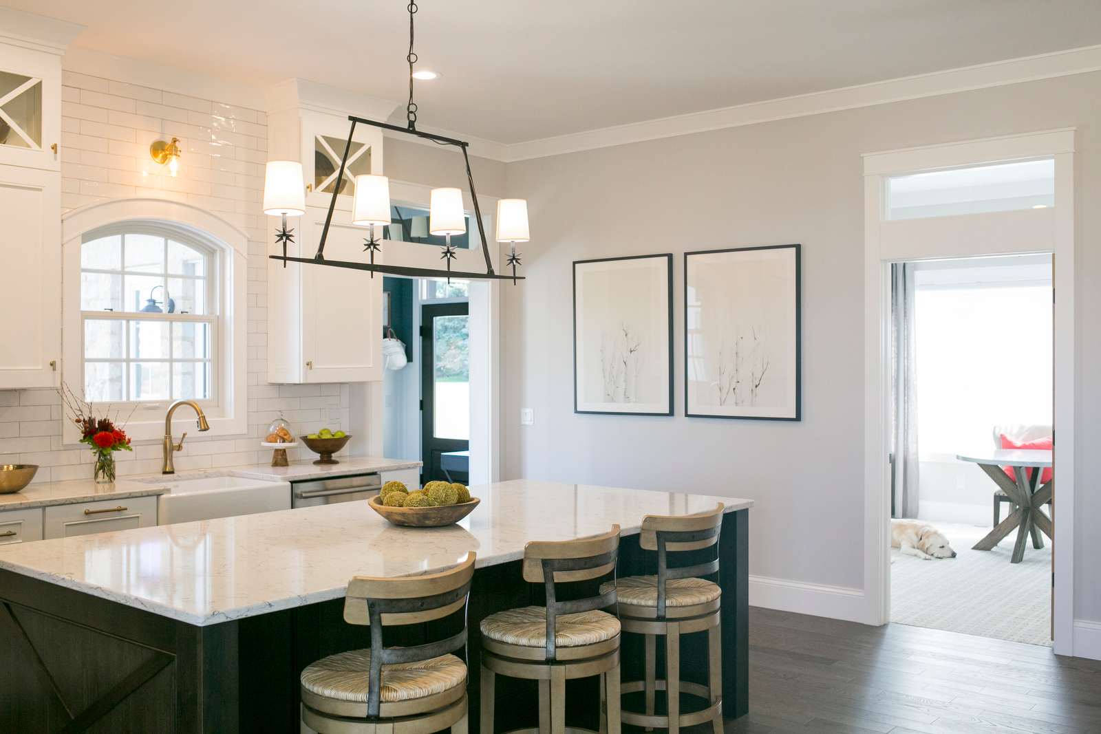
The location is great. It’s proximity to the garage makes carrying in the grocery bags a short trip. It’s right off of the foyer and serves as a welcoming place for guests to gather. Last but not least, it’s close to the patio for grilling out.
We really are enjoying the semi-openess to the dining area. It is nice not being able to see the mess involved in food prep while we’re sitting down to a meal.
The arch top window is a nice balance to all of the straight lines. This area with the dishwasher on the right and the garbage on the left is highly used and we’re happy to report it is very efficient. The spacing between the perimeter and the island is perfect. We love the farmhouse style sink too! The maintenance is less than we expected based on reading reviews. Whew!
We really like having all of the appliances and the sink on the perimeter. It leaves a nice open countertop at the island for eating, working, and gathering. We really like having the microwave in the pantry too. Now if we could just install an automadically closing pantry door…that would be perfection!
The countertop was a difficult decision. One of the last, in fact. We both love it. We love the minimal pattern and the brightness of it. It doesn’t need constant wiping to look nice either. Crumbs don’t stick out like a sore thumb.
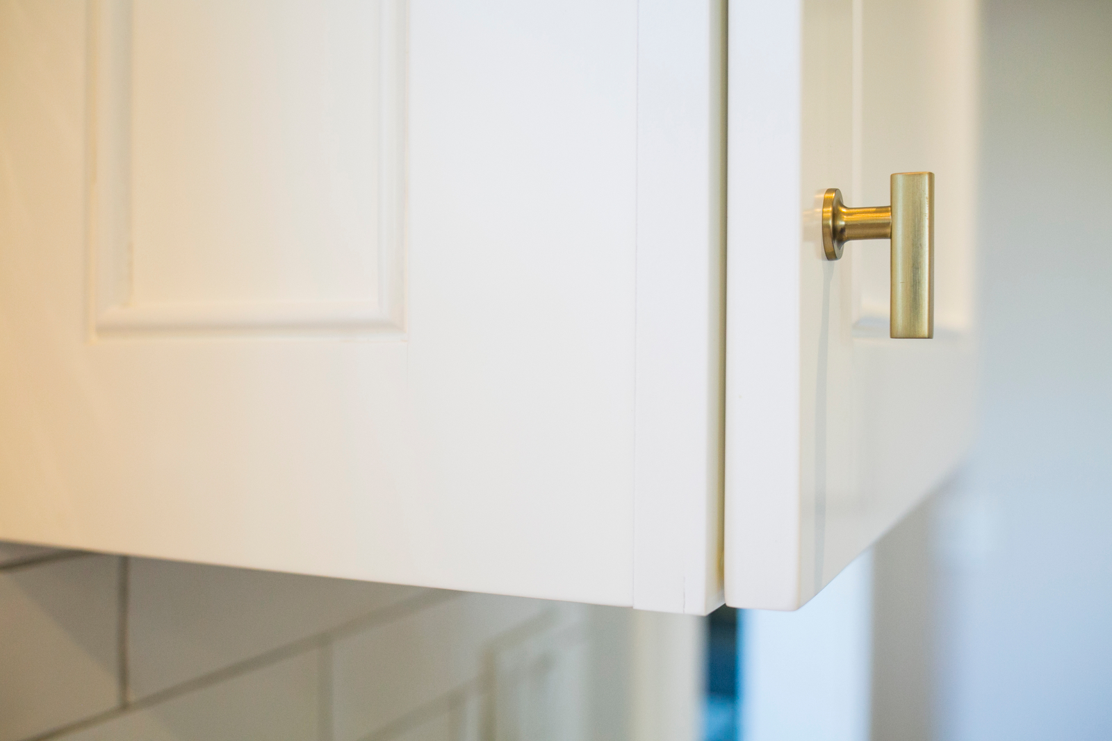
We went with brass finishes and we really like the warmth of it with all of the white. A mix of traditional and modern lines keeps things balanced.
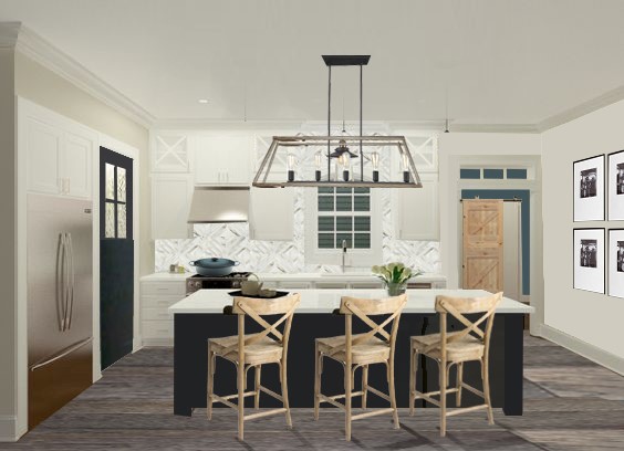
Below is a look back at the process and how it all started with some sketches, renderings, and product selection. Many choices changed through the process but take a look at the SHOP OUR HOUSE page to see the final selections.
Sketch
Renderings
Products
Progress
#30 Outdoor Living
We live in Wisconsin where there are very few weeks during the year where outside dining (and sometimes sitting) is comfortable. Instead of lions, tigers and bears, there are mosquitoes, flies, and bees. Oh my!
Even with the pesky visitors, outdoor living is awesome! Nothing beats grilling out with a cold beer on a warm summer day.
When designing the house, we thought about how these outdoor spaces relate to the indoors. We put the grilling patio near the kitchen. In fact, the kitchen sink is on the other side of that window with the arch top - only 5-ish steps away from the patio. Then we added the screen porch on the other side. Perfect for bug-free dining and lounging. All in, these two areas seat 12 people comfortably with room for extra chairs to be brought in.
We actually love how the patio is tucked away instead of out in the open. We also love that putting the screen porch on the side of the house instead of the back allows for a better view from the dining room.
Besides dining, we also wanted the screen porch to accommodate some lounge furniture. The result is a comfortable mix of dining and lounging with some additional floor space to accommodate larger groups when needed.
Like many of our rooms, it could use a few more decorations but we're keeping things simple for now and loving the extra space.
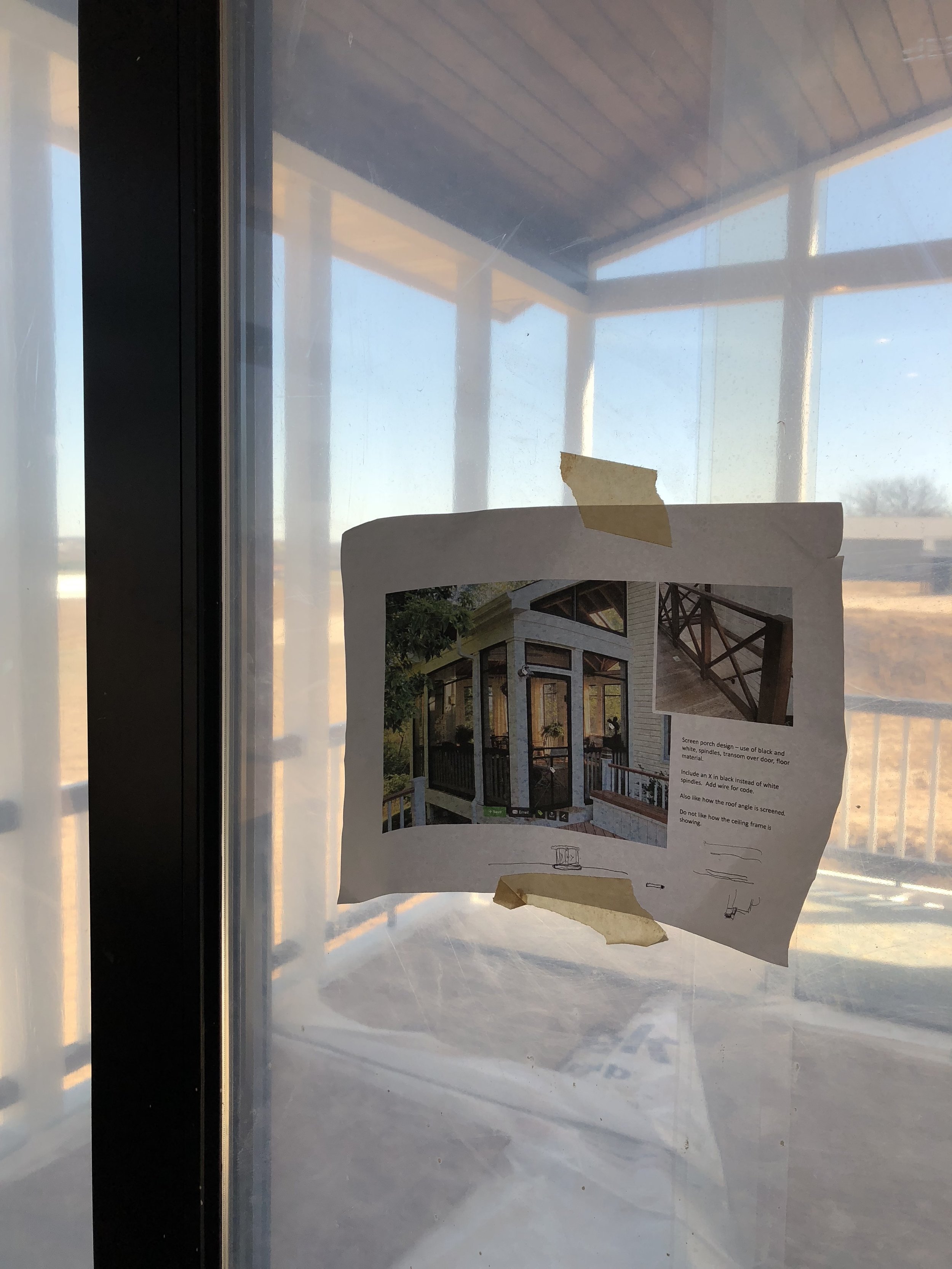
This is a view of our inspiration photo from houzz. It’s nice to have photos like this to reference when construction is happening.
Check out the Shop Our House page to learn more about the products and finishes we selected for our outdoor living.
#29 Paint Chip Art
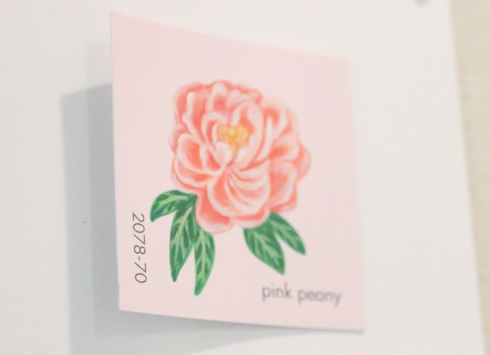
Brent, August, and I went to the Art Fair on the Square here in Madison this summer and the last booth we stopped at was Lydia's. I am captivated by her unique art. She paints on paint chips - you know, the little swatches of color we use to select paint colors for our walls.
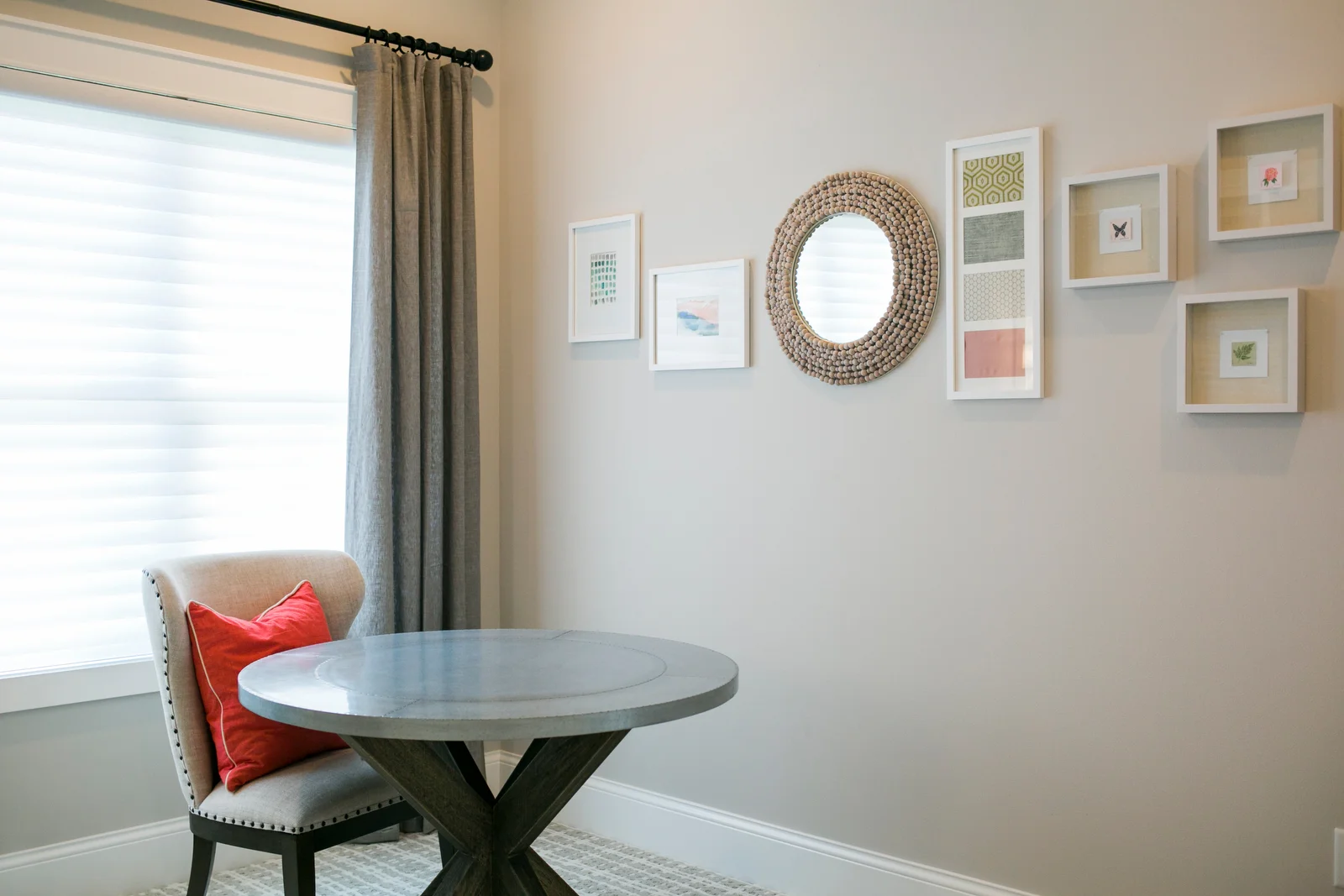
I had one wall left in my office that needed some art. I collaborated with Lydia providing her with pictures of the room and a pintrest page of things that I like. I requested a series of 3.
I absolutely love the paintings she did and how they incorporated into this gallery wall in my office. I purchased shadow boxes with linen backgrounds and white frames and the painting really look beautiful and feel so personal.
Her paint chip art is personal to me because of my profession but her subjects are so diverse reflecting holidays, animals, food, and much more! Check out Lydia's website, instagram page, and etsy shop. It's really awesome!
Click here to visit Lydia’s website!
#28 Building a House: Frequently Asked Questions 2.0
Thank you SO much for your interest in our project. Whether you're interested in having a custom home built, considering a remodel, or have a decorating project, we REALLY hope you find the blog helpful. We've been asked some excellent questions over the past year. We thought we'd share a few of those with everyone.
1. How long does it take?
For us, it took 7 months.
2. There are so many decisions to make, how did you decide to do what you did?
Our education and experience helps - no doubt! But, there's more to the building process than interior design and flooring. Over the past 15 years, we have been careful listeners and observers and we've used that to cultivate our own list of wants and needs. That includes listening to our clients as well as the professionals we work with. We also utilize resources online (houzz, Pinterest, blogs, etc) and use images to inspire our own ideas. We also love a good home and garden TV show. We've actually learned a lot from This Old House and it's good family entertainment. We love walking into the house during construction and saying, "Wow, that is so cool!" when we we get to see some of our ideas finally put in place.
3. With all of the work that you have done in preparation, has everything been seamless?
No. We make regular (daily) trips to the house to check on progress and make sure that all of the details are being done to our specifications. There have definitely been some “slap the forehead” moments and definitely some “tear up and re-do’s” but we are very happy with the outcome in those situations and the way that they have been handled by the people we are working with. If you want seamless, a custom house is not for you!
4. Did you enjoy going over to check on progress?
Yes!!! Most definitely. However, building a home is like having another job that you aren’t getting paid for. With all the planning, site visits, decisions, electrical walk through, HVAC walk through, cabinets, countertops, flooring (Ha Ha), lumber, doors, windows, on and on and on…….. You have to commit yourself to some late nights and full weekends. Even 2 professionals like us can suffer some burnout (not to mention the poor kiddo, thank goodness for some well-placed tech-time #Ithinkweregoingtobeoverondatathismonthagain).
5. How did you deal with ...(insert whatever you want)?
Knowing that not every decision you make in prep is going to work the way you want it to and being able to move past that is paramount to making the home building experience a good one.
Every contractor that works in our home has an opinion on how things should be done. We always listen because his/her experience can definitely lead us in the right direction; however, we also need to trust our instincts. We spent a lot of time thinking through the decisions we're making so we recognize the value in that too.
Thanks again for your interest. If you have any other questions you'd like answered, be sure to send them our way and we'll be sure to answer them in another post!
#27 Window Treatments
We L.O.V.E. our new blinds. Really, we do!
There are 8 windows in the front of the house. We wanted all of the windows to have a similar treatment so the look is consistent.
We love the look of plantation shutters but we felt that the shutters would mostly be covering the windows with the vanes either open or closed. We wanted something that would open up the windows a bit more.
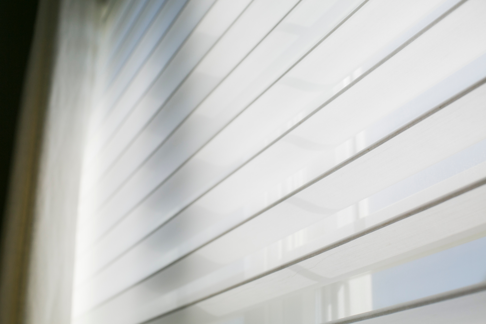
So, we went with Silouettes by Hunter Douglas. The wide vane creates the look of shutters but they roll up nicely into a head rail at the top of the window for a clear open option. They come in wide widths as well so we were able to do just one blind for each set of windows.
The layering of the sheer fabric allows for light to come through but still allows for privacy.
Three reasons why we love THESE BLINDS:
The design allows each vane to magically float between two sheer panels. Creating a sculptural look.
Adjusting the vanes in different angles diffuses sunlight and creates ambient light throughout each room.
Each shade has ultra-sheer panels that allow you to see outside clearly while still protecting you from UV rays.
Even easy to use for august
Because there is a large built-in under our daughter's windows, it would've been a reach to get to a controller on the wall. We splurged a bit more and went with a remote controlled blind to allow for easy up and down. Her blind also has a second layer that blocks out most of the light so she has lots of flexibility in how much light comes in. It's been helpful during the summer when her bedtime is before nightfall.
And now for the cream of the crop…
For the master bedroom and for my office, we installed Hunter Douglas Softtouch™ Motorization blinds. The quick touch of the wand signals the blind to automatically roll open or up. Yes, this feature is expensive but for us... it's SO worth it. We spent a lot of money on these windows and we want it to be easy peasy to see them during the daytime. We know that if we would've had to manually open and close 8 separate blinds every damn day (excuse my french)... it just wouldn't have happened.
We can pop into every room each morning and touch the wand or push the button on the control and we’re ready for the day.
H&R Carpets sells these blinds (and many other brands and styles). Visit hrcarpets.com, stop in, or call (608) 849-7482 to find out more!
#26 Doggie Design
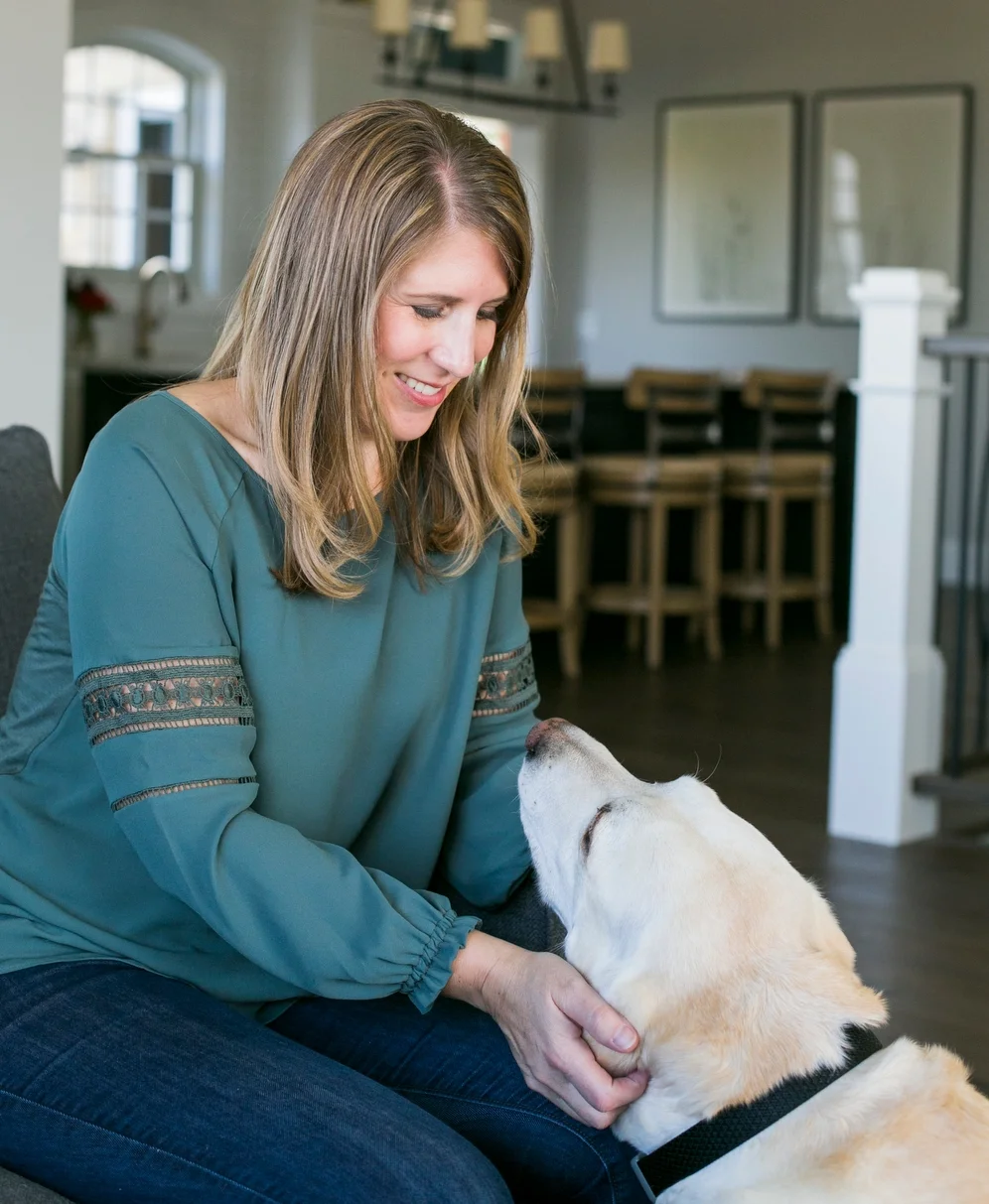
Okay pet lovers, here's what we did to accommodate our fur baby. Meet Toby. He's a 6 year old yellow lab and he's suchagoodboy!
Eat
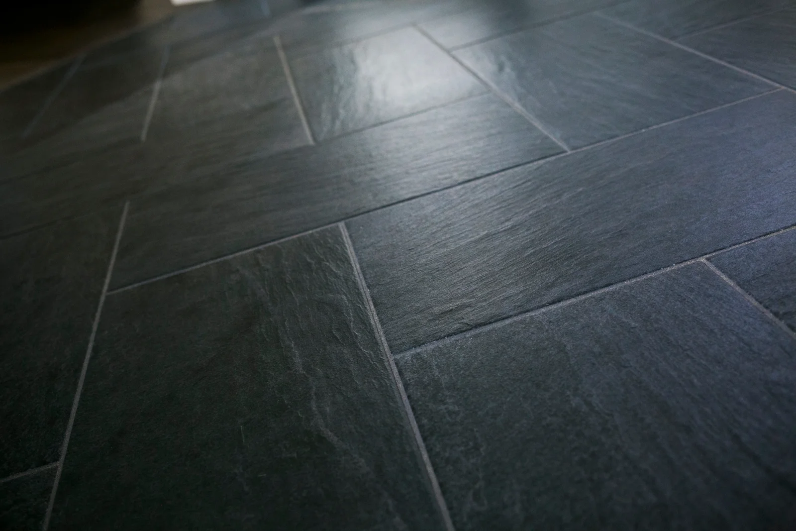
Toby's food is kept in the mud room. We have tile floor in there which is great for easy clean up when he splashes water all over when drinking his water. The cabinets in there have a higher toe kick than normal. This allows us to scoot Toby’s dishes under the cabinets. We also like having the extra under cabinet floor space for shoes and packages.
We kept his food container in mind when designing the closet. We wanted it sit on the floor but have plenty of room above it to take the lid off and get a cup scooped out with ease. These are things we do twice a day every day so we wanted to be easy peasy.
Click the photo of the food container to purchase!
Poop
We're lucky to have such a big yard but we had visions of last minute poo clean up before letting our daughter and her friends roam free so we have a designated area for Toby to go to the bathroom. We hope this also prevents dead spots in the grass. Of course there's a bit of training involved and it was all going so well until the sprinklers came. Once the lawn came in and the sprinklers went away - he’s back on track!
Sleep
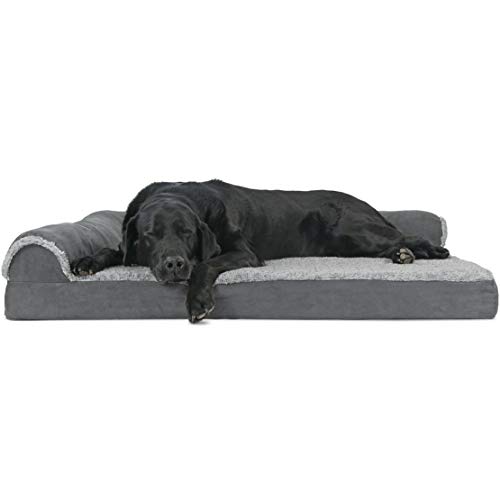
Toby is a mama's boy so he usually sleeps in the master bedroom on his bed. He usually spends his days with with Angie as well. Curled up watching her work. Sometimes he sleeps in our daughter's room and on those nights we slide his bed into her room. It's a pretty flexible arrangement.
photos by: Beth Skogen
We kept things pretty basic for the old Tobster but there are some super fun design ideas for your furry pet. Check out our pinterest folder if you want more inspiration!
Some of Toby’s (and our) Favorites
Click on each image to find out more!
#25 Interview with an Intern
This past summer H&R Carpets and Angie Schwab Interiors provided a joint internship to Kelsey Nonn. She's a student currently studying interior design at Madison College. As part of the internship, we asked Kelsey to help us out with our blog. She offered some questions for me to answer interview style - things that she was interested in learning and so she thought other folks might be interested in as well. Here's the interview:
1. Was there a defining moment when you knew you wanted to become an interior designer? If so, what was that moment like?
No, there wasn't a defining moment for me. It was a slow process of realizing an interest. Looking back, it was always there. I have always enjoyed color, texture, and pattern. I have always had a heightened awareness of my surroundings and the emotional changes that come with the physical changes in our environment. The ability to affect things has always intrigued me.
Interior design is a second career for me. I worked in information systems at Kraft Foods first. After I moved away from home and later became a home owner in my early 20's - that is when I first considered interior design a career choice
That’s me in 1980!
2. Where did you study interior design?
I studied interior design at UW-Madison. I received a Bachelor of Science in Environmental Textiles and Design in 2007. I also have a Bachelor in Business Administration from UW-Eau Claire. I received that degree in 1998.
The door that would lead me to my new career!
Classroom in the School of Human Ecology
3. When did you decide to take the leap and start your own business?
I started my interior design business in 2004.
I knew I wanted to be a business owner well before I knew I wanted to be an interior designer. I took marketing courses in high school and continued taking business classes while attending UW-Eau Claire after high school. I read books about entrepreneurship and biographies about entrepreneurs. To this day, I'm still fascinated by people's stories. Being a business owner takes courage, confidence, and a serious work ethic. It demands that you work hard to figure things out even if it's outside of your area of expertise.
4. Why did you decide to start your own business instead of going to work for someone else?
I enjoy having the responsibility to set standards for how our clients are treated. Since most of our projects are residential - I am invited into people's homes. This honor comes with a responsibility to be respectful and empathetic. Listening to my client's needs is the most important thing. I also enjoy having the ability to be flexible and adaptive. The options available for purchasing home furnishings and fixtures has drastically changed since I started the business 14 years ago. I can meet those needs by using trade vendors for a full service experience, local retails for a more personal feel, or online vendors offering convenience and variety. We also offer e-design where we send you a completed plan and all the information you need to implement it without even meeting.
5. Between having a family and 2 businesses to run, how have you gotten through some of the more difficult times?
It hasn't been easy! We've had some serious challenges along the way both personally and professionally. Having a loving and supportive husband helps. We believe in each other and we love each other very much. When the going gets tough, you pick yourself up and do your best to learn from the situation.
6. If there was one thing you learned along the way that you’d want to share with others, what would it be?
Never. Stop. Learning.
Hang out with people smarter than you.
Never assume someone doesn't have something to teach you.
Read.
Listen.
As a designer, always be aware of your surroundings and how you feel in those surroundings. Analyze why.
Some of my favorite books and podcasts for inspiration:
7. How has your business grown or changed over the years? Have you changed with it?
Each project is different so the depth of knowledge and experience that I have has increased. I also have a wonderful list of resources. I've met a lot of creative and talented folks through the years. Harnessing their talent in a team effort has led to really beautiful work.
Another aspect that has changed is technology. We use digital images to convey our ideas and aid in the design process. The digital images get surprisingly close to reality. This offers clients an added sense of comfort that they're going to love the space when it's completed. Many of the purchases we make for our home are long-term. Making sure you love them is really important.
8. What has inspired you to continue to want to be a designer (and run your own business) every day?
photo by: Beth Skogen
After all of these years, I'm still so aware of how we are affected by our environments and I have an emotional attachment to the word "home". It's such an important place. Living in a home that is filled with things that provide beauty, happiness, comfort, and safety is so important. Being a part of helping our clients achieve that feeling is so rewarding!
I am also really excited about the unique service that we offer and the unique way we deliver that service. We don't rely on product sales. We make the best design decisions for our clients based on his/her budget and preferences. This leaves our client with a sense of comfort about our motives and excitement about the way we can curate their selections for a unique and interesting look . Our delivery with digital images is really unique.
#24 August's Room
Welcome to August’s room! This is a place for rest and reading. Ahhhhhh!
It was important to keep this room fun and colorful while still being flexible for change as she (choking back tears) grows up. The finishes are light and neutral but the furnishings and accessories offer the interest. My favorite being the books - loads of color!
We used her twin mattress to create a window seat. It's a great spot to have when friends sleep over. See this previous post where we discuss my love of window seats.
There's lots of storage in the walk-in closet for her clothes and in the built-ins for her treasures. Picture me doing a one-arm sweep of all things messy into these drawers before company arrives!!
There's still some decorating to be done in here... but the structure is in place and it's fully functioning! Looking forward to our next overnight visitor.
Bedding
This cute pom bedding from Pottery Barn Kids coordinates so nicely with the modern circle rug. Honestly, I thought it would get kicked to the bottom of the bed every night in lieu of her Moana blanket but she really likes it and wraps up in it every night.
A rug over carpet?
Yes, please! Okay, so let's get real, who picks carpet this light for a 6 year old? This girl! I wanted neutral walls and neutral floors that could be light and welcoming. The rug, the bedding. the accessories... those can change as she gets older.
Add some texture!
She loves the cuteness of this pouf and I love the texture. This is the way to do hot pink! It feels youthful and fun but it doesn't scream "kids room".
Lighting
Speaking of F-U-N ! I love this paper flower light from Ikea. So much to look at this room from the colorful books to the upholstered headboard to this fun paper light.
Pillow FighT!
I loaded the room with a total of 11 pillows. Below is a colorful pillow with a modern print. I love the texture!
Details
August picked these glass knobs from Amerock. The size is what makes them interesting. We replaced the standard knobs from her night stand to coordinate with this built-in. The drawers are perfect for housing all of her treasures.
Books = Color
Watch out book worms, this room is stocked! Reading to our little girl is a constant and one of our favorite things. We've got quite a collection of favorites and well loved books. I absolutely love that these are on display. The memories we have and will create of us together with a book are priceless.
Some of August's favorite books:
Angie's favorites to read to August:
Brent's favorites to read to August:
Here's a link to our pinterest board with a complete list of our favorites.
See something you want to know more about? Check out our Shop Our House page to get links to some of the products we used in August's room.
#22 Solid Gold - Coordinating finishes
It's true, brass is back.
You might be thinking..."but I just got rid of the shiny brass in my house!" As with most trends, this resurgence is being done differently. A more matte finish with more modern lines is what we're seeing this time around. Honestly, I am loving it. It's such a beautiful compliment to grey and it adds a touch of warmth to any room.
Coordinating the brass finishes in the various fixtures was tricky. The variety of options out there is extensive. There is brass finishes with orange tones and very yellow tones. There is matte brass and polished brass. Finding a style I loved in the right color and finish was a bit of a challenge.
My first pick was the light sconce from School House Electric. I enjoy the hand crafted classic look, the interesting Edison style bulb on display through the clear glass, and the adjustable arm. I like them so much, I added two more on the staircase wall.
For the cabinet knobs and pulls, the size of the wall cabinet doors required something more substantial than a round knob but I dind't want to put a large pull on the doors. This linear knob style from Emtek is the perfect compromise. The drawer fronts, on the other hand, called for some long pulls. the shape of these coordinating pulls is simple yet substantial.
More practical considerations were needed when selecting the faucet. This faucet from Delta has the Touch2O technology allowing you to lightly tap the neck of the faucet for instant flow. I love how this keeps the water drips off of the countertop and the dirty hands off of the handle. The faucet has a few more curves than the sconce and pulls. I like how this will relate to some of the other elements in the room that aren't so modern.
The brass finish available in this style was limited and although the shade of gold is a bit different on all three of these fixtures, the combination is working.
These brass fixtures are nice but including more accessories in brass will enhance the effect even more. Some decorative brass bowls are on display in the glass cabinets and another on the countertop. Lamps and other brass accessories will continue to be used in the dining room and family room.
Sometimes going back to a trend that I grew up with is hard but with brass, the style is so different and the mix of metals allows it to be interesting and not overpowering. I'm really excited about this "new" trend.
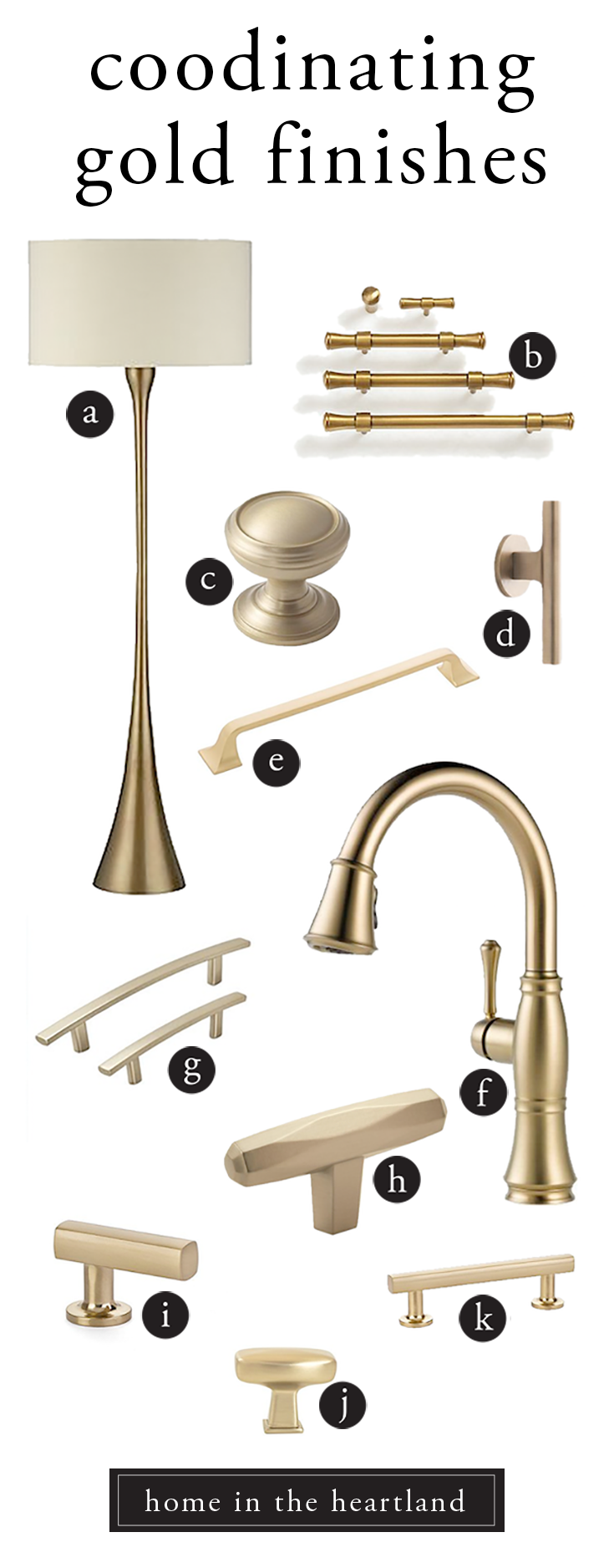
Here's a little more inspiration for gold finishes:
a. Crate & Barrel Melrose Brass Floor Lamp b. Balard Designs Paulette Hardware c. Amerock Mushroom Cabinet Knob d. School House Galley Pull e. Hickory Hardware Forge Pull f. Delta Cassidy Faucet g. Amerock Pulls h. Amerock St. Vincent Bar Knob i. Emtek Freestone Finger j. Berenson Pull k. Emtek Freestone Cabinet Pull


