Sharing the 7 Principles of Interior Design
Read More#33 Tech to simplify our day
Automated Faucets
1. We automated the faucets with this motion or touch technology from Delta Faucets. It keeps the countertops clean from dripping hands and it keeps faucets clean from dirty fingers. Oh, and it makes the necessary yet mundane things like washing hands go faster. It even has an LED light that indicates the water temperature. We have these faucets in the main bathroom, the master bathroom, and in the kitchen.
Automated Blinds
2. We automated the blinds with PowerView and SoftTouch technology from Hunter Douglas. With a quick tap on the wand or a click on the remote, the blind moves in place while you walk away. Once again, a twice-daily task is faster making our day more efficient and our outlook (literally) sunnier.
Automated Garbage Bin
3. We automated the garbage cabinet with servo drive technology from Blum. With a gentle push on the handle or the door, the garbage pops out at me. Our first thought was to keep the cabinet in good shape but having the ability to open this cabinet hands free is awesome (like when I just cracked an egg)! It’s another small way to make daily tasks more efficient.
Automated Lighting
4. We automated the lighting with motion sensors. More often than not, my hands are full when I'm entering certain rooms like the mud room or the laundry room. A motion sensor removes the burden of stumbling through a dark room or having to drop everything to flip a switch. Every time I enter the laundry room with a full basket of clothes in my hand, I’m so grateful for that sensor. Also, coming in from the garage with my arms loaded with my work gear and the mail, I’m so grateful for that sensor. We used the Lutron brand in our home which also has some great additional features that allows us to control some of the dimmers with an app on our phone.
All of these features cost a bit more but daily life is so much more efficient! Keep in mind that many of the features involved some planning and a lot of help from our electrician. We can still both recall our frozen feet and hands when doing the electrical walk through very early on in the building process. Thinking through these details, however, has proven to be so WORTH IT!
#31 Kitchen After Photos
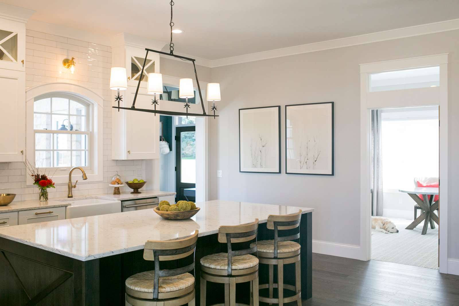
The location is great. It’s proximity to the garage makes carrying in the grocery bags a short trip. It’s right off of the foyer and serves as a welcoming place for guests to gather. Last but not least, it’s close to the patio for grilling out.
We really are enjoying the semi-openess to the dining area. It is nice not being able to see the mess involved in food prep while we’re sitting down to a meal.
The arch top window is a nice balance to all of the straight lines. This area with the dishwasher on the right and the garbage on the left is highly used and we’re happy to report it is very efficient. The spacing between the perimeter and the island is perfect. We love the farmhouse style sink too! The maintenance is less than we expected based on reading reviews. Whew!
We really like having all of the appliances and the sink on the perimeter. It leaves a nice open countertop at the island for eating, working, and gathering. We really like having the microwave in the pantry too. Now if we could just install an automadically closing pantry door…that would be perfection!
The countertop was a difficult decision. One of the last, in fact. We both love it. We love the minimal pattern and the brightness of it. It doesn’t need constant wiping to look nice either. Crumbs don’t stick out like a sore thumb.
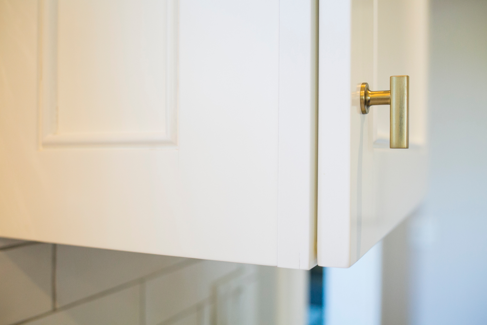
We went with brass finishes and we really like the warmth of it with all of the white. A mix of traditional and modern lines keeps things balanced.
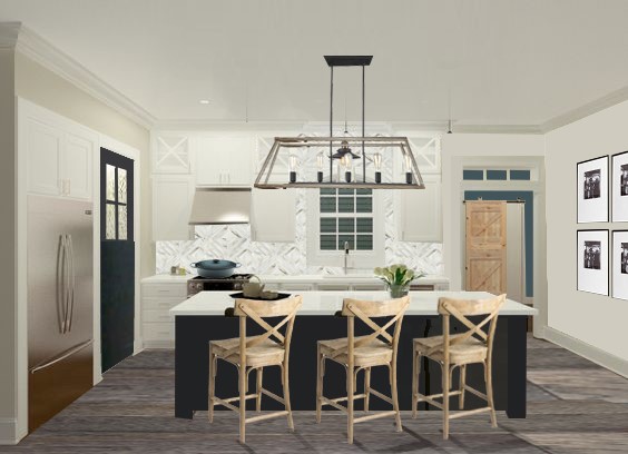
Below is a look back at the process and how it all started with some sketches, renderings, and product selection. Many choices changed through the process but take a look at the SHOP OUR HOUSE page to see the final selections.
Sketch
Renderings
Products
Progress
#16 Wood Flooring
We can't wait to tell you about the wood floor we selected. It's this amazing product by Lauzon and get this...it IMPROVES the air quality in your house! Brent explains it all in the video below.
The sample Brent is holding is the actual color we picked. There is so much we like about it and there are so many reasons why this is "the one."
We love the color! The brown will add warmth to our home and the undertones of grey will complement our other selections nicely. The wire brushed texture combined with the satin finish keeps the floor on trend. We like that it is oak. Oak is known for being a strong and durable wood. We also like that this floor can be sanded down and refinished in the future. It's hard to think that far in advance (especially when everything is brand new) but, we know our preferences will change and want to be prepared.
The wood floor will go in our kitchen, living room, dining room, hallway, and master bedroom. We can't wait to see how this improves the indoor air quality of our house. This is truly fascinating technology for the flooring industry!
#7 Kitchen Layout
With so much happening in this integral space, we began the kitchen design process by analyzing what we like about our current kitchen - and, of course, what we would prefer to change.
We came up with the following "must haves":
1. A countertop free of small appliances
2. A semi-open concept
3. An island with seating
4. A "right-size" kitchen - not too big, not too small...just right
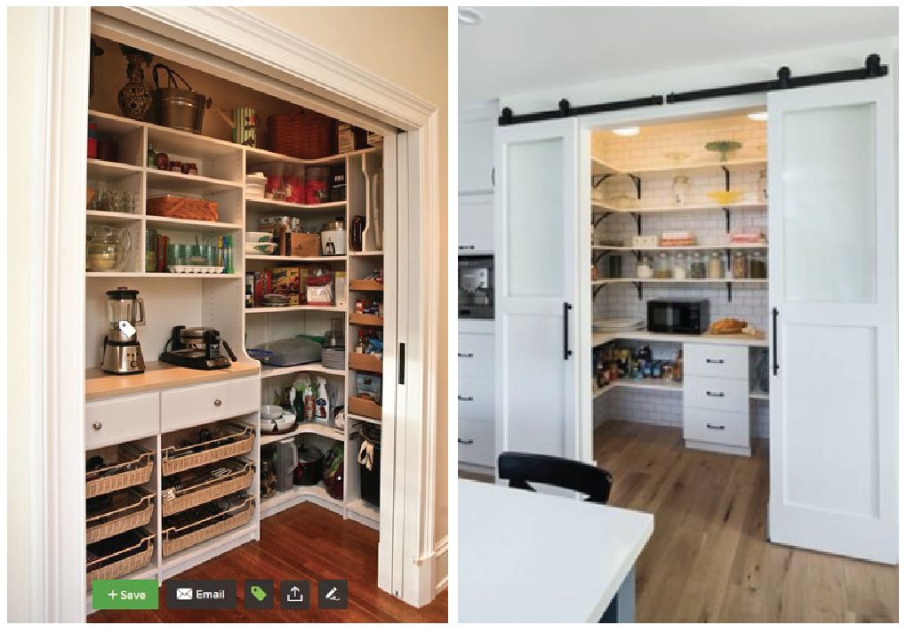
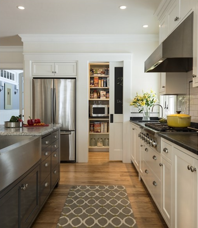
In order to declutter the countertops, we decided on a closet or pantry with its own surface area and plenty of electrical outlets. We found inspiration on both Houzz and Pinterest - particularly from the following images:
houzz source: Marie Newton, Closets Redefined | Pintrest source: article from Town and Country Living
The actual location of this pantry was not as easily decided. It was the focus of the floorplan for many weeks until we came upon this images from Houzz:
houzz source: Whitten Architects
The kitchen layout accomplished all four of our goals. Of course, there is always some customization for personal preferences, so you will note there are a few differences. The most notable change being we only need one sink and prefer it on the perimeter wall instead of in the island.
While the specifics of the kitchen are still being worked out, along with the detailed cabinet plan, this is the ideal layout that includes our "must haves" outlined above.
1. A countertop free of small appliances - The pantry offers a place for them.
2. A semi-open concept - The combination of the pantry and the refrigerator allow for some separation between the dining room, and it is around the corner from the family room.
3. An island with seating - There is an island with seating for three.
4. A "right-size" kitchen - It is all in a relatively efficient space.
While we cannot wait to get in there and start cooking, there is still much to be determined before it can even be built. More to come! In the meantime, below are some construction updates. Enjoy the holiday season close to your loved ones.
Here's to a great 2018 to you and yours. Cheers!
The garage is filled in.
Insulation and waterproofing on the foundation walls.
A view of the back.
Enjoying construction site visits.


