Living Room - Where we Shop

Thank you to all of our readers that have sent in questions wondering…WHERE DO YOU SHOP? This is a series of posts listing many of the purchases broken up by room. We started with the master bedroom and bathroom and now we’re moving on to the living room.

At the bottom of the post are images of some of the items you see in the pictures. Just click on the image to learn more about each product. We hope our design ideas inspire your purchases. Happy Shopping!

Similar products are listed if products are no longer available. See disclaimer for information about affiliate links.

180914_AngieSchwabInteriors_0177.JPG

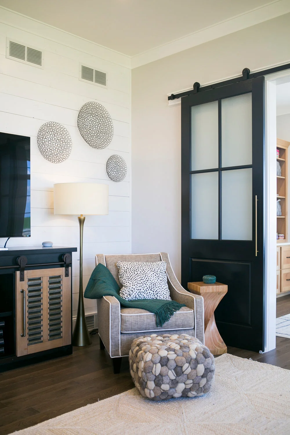
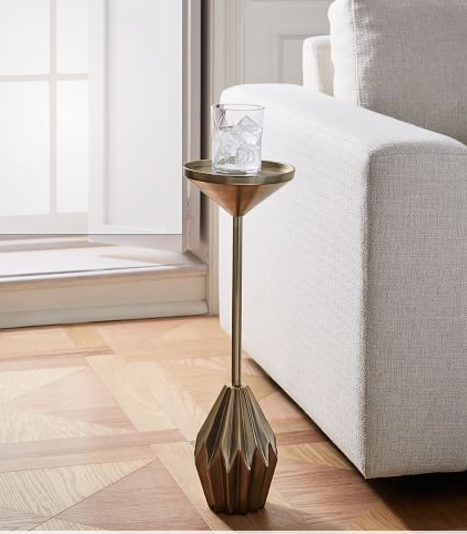
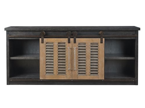
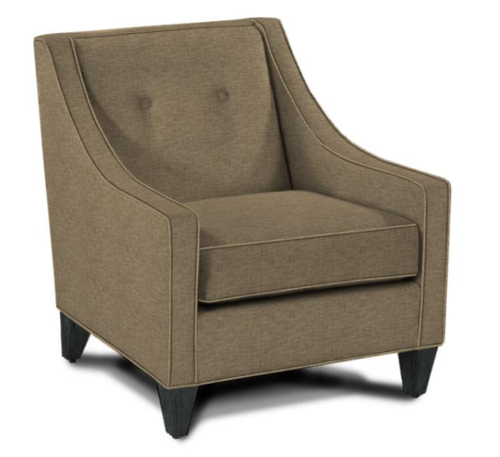
With no formal and informal living space, we wanted this room to feel inviting and relaxed, but, in a tailored way. All of the upholstered pieces are from Rowe Furniture and feature custom fabrics in neutral colors with subtle textures. The ottoman has a black and white hounds tooth pattern. The side table is from Wayfair and came unfinished so that we could stain it to match the kitchen island. A cute Art Deco style drink table in gold serves its purpose without taking up too much space.

180914_AngieSchwabInteriors_0200.JPG

The paint color we used on the walls throughout the main areas is called First Star. It’s light and bright, but still has some contrast with the white trim. The trim color is called High Reflective White. The barn doors are painted Black Magic. All paint colors are by Sherwin Williams.

The wood flooring throughout the first floor is 3/4” thick solid red oak by Lauzon and it’s provided by H&R Carpets & Flooring. This post has a video that describes the wonderful air filtering benefits to this smart floor. Almost two years later, we couldn’t be happier with this choice!


Master Bathroom - Where we Shop

Thank you to all of our readers that have sent in questions wondering…WHERE DO YOU SHOP? This is a series of posts listing many of the purchases broken up by room. We started with the master bedroom and now we’re moving next door to the master bathroom.

At the bottom of the post are images of some of the items you see in the pictures. Just click on the image to learn more about each product. We hope our design ideas inspire your purchases. Happy Shopping!

Similar products are listed if products are no longer available. See disclaimer for information about affiliate links.

The most frequent question I get is, where did you buy your mirrors from? Here’s the link. The round shape softens things up and the black metal frame adds a nice modern touch. The vanity was custom made out of hickory wood and was stained to match the wood floor in our master bedroom. The engineered quartz countertop is a pattern called Torquay by Cambria. The floor tile is porcelain and the wall tile is marble in a hexagon shape. Both tiles were provided by H&R Carpets & Flooring. The light fixtures are another one of my favorites and can be found here. The faucet is beautiful, but it was chosen MOSTLY for functional reasons. We like that is is a single handle and we LOVE that it has touch technology. This makes our routine more efficient and keeps water drips to a minimum on the countertop.

This built-in cabinet has loads of storage for linens, lotions, and potions. The cup pulls on the drawers are a reference to the farmhouse style we enjoy, but have low contrast with the stain on the cabinet for a subtle effect. We ordered the upper cabinet doors without the glass. The cabinet maker prepped them and the glass was antiqued and installed by a local glass company. The knobs on our interior doors can be found here. Also, not pictured is our custom tile shower by H&R Carpets & Flooring. Instead of adding a built-in bench, we chose to include a piece of furniture so that we had flexibility in how it gets used. For now, it’s used as a towel holder on the far end of the shower. The color is almost a perfect match to the tile in the floor.


Master Bedroom Retreat - Where we Shop

Thank you to all of our readers that have sent in questions wondering…WHERE DO YOU SHOP? This is the first of a series of posts listing many of the purchases broken up by room. We’re starting with the master bedroom because, you know, we could all use a relaxing retreat these days to calm the nerves and rest.

At the bottom of the post are images of some of the items you see in the pictures. Just click on the image to learn more about each product. We hope our design ideas inspire your purchases. Happy Shopping!

Similar products are listed if products are no longer available. See disclaimer for information about affiliate links.

180914_AngieSchwabInteriors_0068.JPG

We reused our bedside tables from our previous home. They were given new life with a coat of paint on the bottom and stained tops. We added mirrors above to simulate windows and provide symmetry. The headboard was made-to-order by Rowe Furniture. The lamps are from Crate & Barrel. The duvet and shams are listed below, but we added two layers of comforter for fullness. We purchased one like this. Check out our previous post for more tips on bedding. The chandelier is one of my favorite elements. The mix of rustic with a touch of sparkle is perfect for our informal taste. Last, but not least, is our mattress. We purchased this locally at Waunakee Furniture ETC. Every night I am so thankful for the comfort this mattress provides. It is the BEST!

180914_AngieSchwabInteriors_0075.JPG

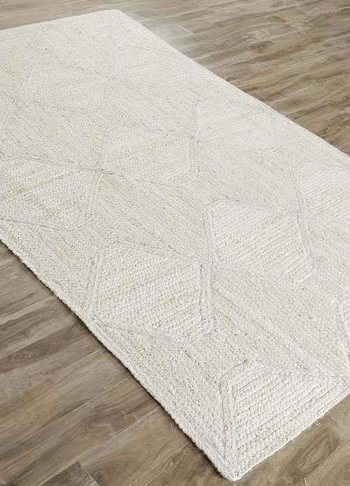
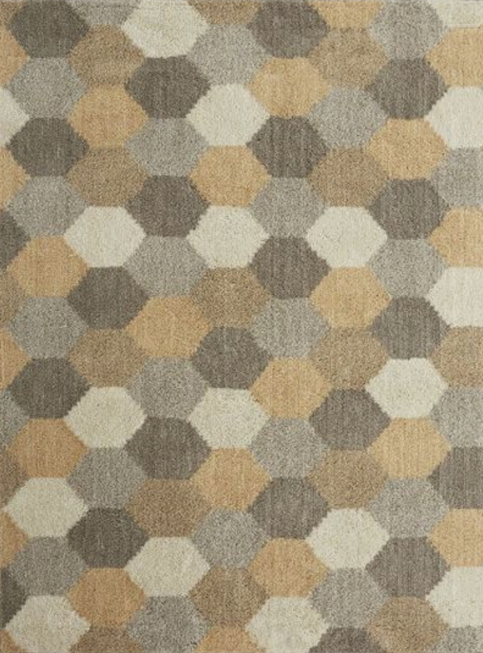
We used a very light grey paint color in this room to keep things light, bright, and neutral. The dresser received the same paint treatment as the bedside tables. The beautiful tapered legs on this piece pop next to the wood flooring. The rug adds some needed pattern AND needed warmth to the room. This is a really economical rug that works for both indoors and outdoors. The low pile height is easy to clean - which is great because our dog spends a lot of time on this room. The vases on the floor were a Target find. The curtain panels are from Pottery Barn and the blinds are by Hunter Douglas and are sold at H&R Carpets & Flooring. Below are some additional accessories including a vintage-inspired lamp and a cream throw. The blanket ladder was ordered from Etsy.


#38 The 7 Principles of Interior Design

Sharing the 7 Principles of Interior Design

Read More

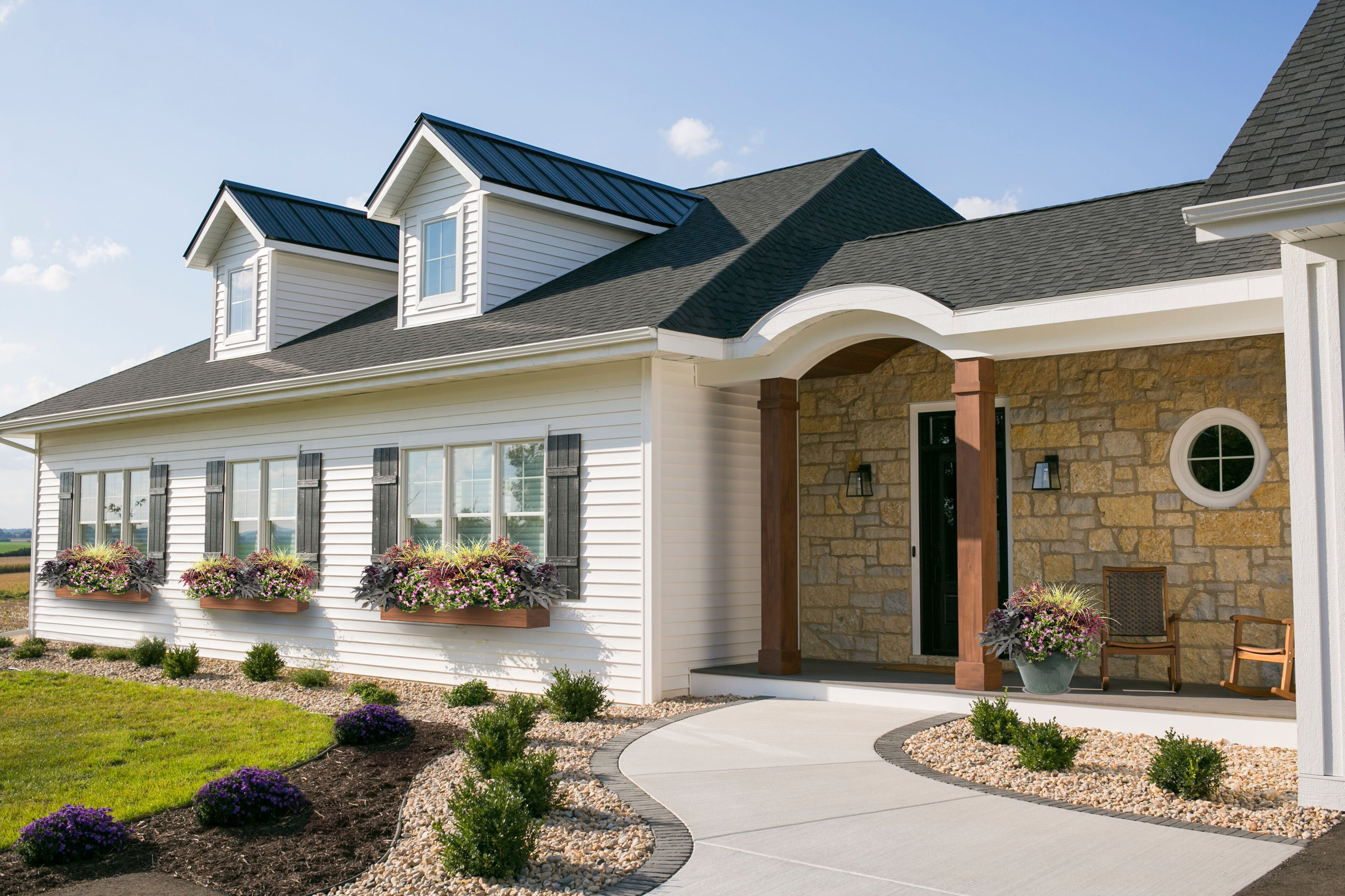
#36 Window Box Planters

This warmer weather has us thinking that spring might be here to stay. Or is it too soon to put away the snow shovel? It really is hard to know what Mother Nature will send your way when you live in Wisconsin. Nonetheless, we are crossing our fingers and hoping for spring, mostly so we can start designing our flower boxes!

We created a Pinterest board with our favorite flower box ideas and color palettes. You can take a look at it to get some inspiration for your own home, and to see what we are loving this year.

A wonderful mix repeating the purple from the sage

A wonderful mix repeating the purple from the sage

A more formal approach with pops of red

A more formal approach with pops of red

An informal mix of purple and magenta

An informal mix of purple and magenta

A brighter choice with magenta

A brighter choice with magenta

We are torn between a whimsical and natural looking “wild flower” assortment, and a more-tailored arrangement of blooms. We think we have a favorite, but we are hoping to hear from our followers on which look they like the best. You can head over to our Instagram page to help us decide!
It is really reassuring that we can change the look of our landscaping up each year so we don’t need to stress out about permanence.  Whatever we end up with, we will make sure to repeat the floral groupings at the front porch in a planter, to balance the home and to carry over the colors and texture of the botanicals from our window boxes. This is a fun project that we looking forward to taking on in the next few weeks.  Here’s hoping for spring!

#33 Tech to simplify our day

Automated Faucets

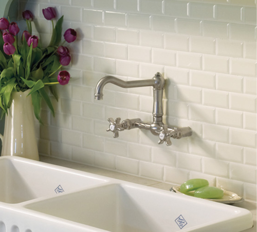
1. We automated the faucets with this motion or touch technology from Delta Faucets. It keeps the countertops clean from dripping hands and it keeps faucets clean from dirty fingers. Oh, and it makes the necessary yet mundane things like washing hands go faster. It even has an LED light that indicates the water temperature. We have these faucets in the main bathroom, the master bathroom, and in the kitchen.

Automated Blinds

2. We automated the blinds with PowerView and SoftTouch technology from Hunter Douglas. With a quick tap on the wand or a click on the remote, the blind moves in place while you walk away. Once again, a twice-daily task is faster making our day more efficient and our outlook (literally) sunnier.

Automated Garbage Bin

3. We automated the garbage cabinet with servo drive technology from Blum. With a gentle push on the handle or the door, the garbage pops out at me. Our first thought was to keep the cabinet in good shape but having the ability to open this cabinet hands free is awesome (like when I just cracked an egg)! It’s another small way to make daily tasks more efficient.

Automated Lighting

4. We automated the lighting with motion sensors. More often than not, my hands are full when I'm entering certain rooms like the mud room or the laundry room. A motion sensor removes the burden of stumbling through a dark room or having to drop everything to flip a switch. Every time I enter the laundry room with a full basket of clothes in my hand, I’m so grateful for that sensor. Also, coming in from the garage with my arms loaded with my work gear and the mail, I’m so grateful for that sensor. We used the Lutron brand in our home which also has some great additional features that allows us to control some of the dimmers with an app on our phone.

All of these features cost a bit more but daily life is so much more efficient! Keep in mind that many of the features involved some planning and a lot of help from our electrician. We can still both recall our frozen feet and hands when doing the electrical walk through very early on in the building process. Thinking through these details, however, has proven to be so WORTH IT!