#16 Wood Flooring

We can't wait to tell you about the wood floor we selected. It's this amazing product by Lauzon and get this...it IMPROVES the air quality in your house! Brent explains it all in the video below.

The sample Brent is holding is the actual color we picked. There is so much we like about it and there are so many reasons why this is "the one."

Screen Shot 2018-02-27 at 6.17.25 PM.png

We love the color! The brown will add warmth to our home and the undertones of grey will complement our other selections nicely. The wire brushed texture combined with the satin finish keeps the floor on trend. We like that it is oak. Oak is known for being a strong and durable wood. We also like that this floor can be sanded down and refinished in the future. It's hard to think that far in advance (especially when everything is brand new) but, we know our preferences will change and want to be prepared.

The wood floor will go in our kitchen, living room, dining room, hallway, and master bedroom. We can't wait to see how this improves the indoor air quality of our house. This is truly fascinating technology for the flooring industry!

#15 Art Room

Back on the last day of December, one of the coldest days of the season, we did a walk-through to see the framing. One of our favorite rooms in the house is in the northwest corner - it's an art room!

Last weekend we stopped back to check on the progress. The drywall is up and the texture is on. It gives us a really good feel for the space and all of the light that will pour into this room.

We were even able to get our shy little girl to make an appearance on camera! Which tells you how excited she is for this new room.

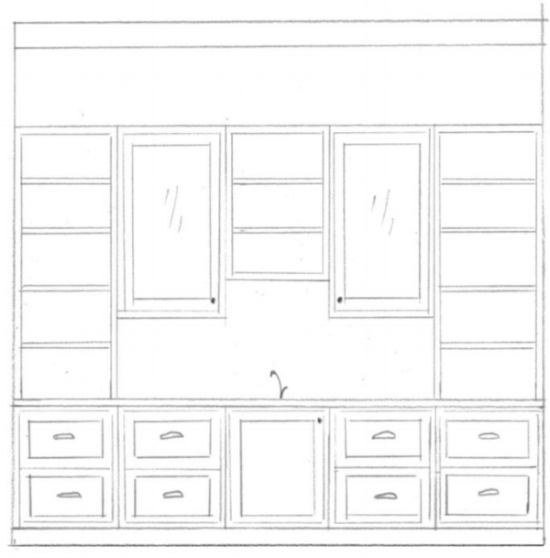
A sketch of the built-ins planned for the south wall.

A sketch of the built-ins planned for the south wall.

The built-ins are designed with a sink for washing up, drawers to store supplies, and open shelves to give projects a place to dry.


Idea-Tip.png

It's good to have back-up plans for specialty rooms like this. We made sure that the walls are not load bearing so that we can extend our living room once it's time for this room to evolve.


A peek into the art room from the living room

A peek into the art room from the living room

We're excited to share the dramatic changes that paint and flooring will bring to our home in the next couple of weeks. Stay tuned!

#14 Bathroom Dilemma - How Many?

As we were laying out our floor plan and looking at our wants and needs we had to ask ourselves these questions. How many baths should we include on our main level? What is typical? What is needed? What is preferred?

The current trend in residential construction for homes our size is to have a minimum of:

  1. A full master bath

  2. A full main bath

  3. A powder room

In the house we're currently living in, we have 1 full bath and 1 tiny powder room (seriously, it’s small!). We've been living here for 17 years. For us, adding another full bath is going to be pure luxury. We’re SO looking forward to the efficiency that will come with having an additional shower in the house.

With that said, we decided that the second full bath on the main floor will also be used by guests. No powder room on the main floor for this family. This change will allow us to use that square footage in better ways, as well as spend a little bit more on both bathrooms with some upgraded fixtures and tile. 

The practicality discussion is over (you know we like to be practical) - now on to the fun stuff!

Let’s start with a little architectural inspiration from Houzz. The use of a half wall, or pony wall, to separate the vanity and stool is a common feature in bathrooms. It hides the stool and puts the focus on the prettier things like the vanity, light, mirror, countertop, and faucet.

 
Source: Houzz and Fluidesign Studio

Source: Houzz and Fluidesign Studio


The design in this photo from Fluidesign Studio takes that half wall a step further with a cased opening up and around the half wall. Since we have a planned ceiling height of 9’ in the bathroom, this feature will work for our house! We’re excited for the architectural detail this will add to the room. In fact, we like it so much, we decided to add it in the master bathroom, too.

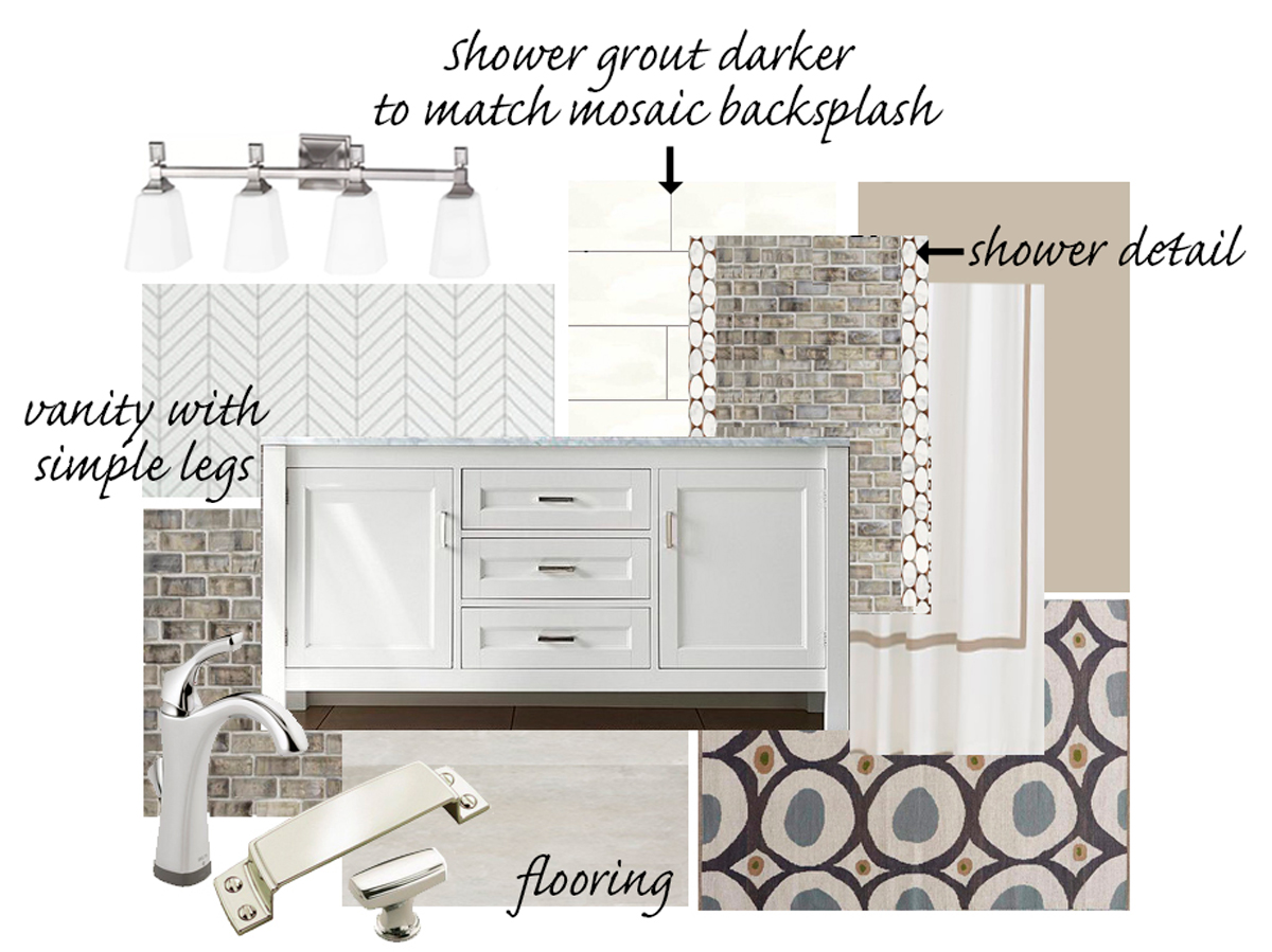
On to the tile, lighting, vanity, and wallpaper. While the accent tile has an iridescent quality to it and the rug is a fun modern pattern, the majority of the materials we selected are neutral and classic. A chrome finish on the light, faucet, and cabinet pulls will unify the different elements and add a little sparkle.

1-AS-main-bath.jpg

You may have noticed that I said wallpaper. (Gasp!) It's not the wall treatment dujour, but it can add so much interest to a room. One tiny, itty bitty wall in the main bathroom is going to receive the wallpaper treatment.


Idea-Tip.png

ProTip  Wallpaper adds pattern and texture to a room. This can be done very subtly with a woven natural wallpaper like grasscloth, or boldly with a high contrast print. Luckily, these stylish, modern wallpapers are far easier to remove than the ones of our childhood, too. Below are 4 different examples.


After an extensive search for the perfect paper, we landed on two options.

OPTION 1

1 AS main bath and hall.jpg

A subtle herringbone pattern with neutral colors by Serena and Lily.


OPTION 2

1 AS house main bath paper 2 .jpg

A wallpaper by York with a really interesting metallic sparkle to it. The pattern is also very geometric and modern. While we really like both, we decided on option one. We feel that this pattern is a better fit for the main bath.

While the countertop and floor are mainly grey, the wallpaper, paint color, and accent tile work together to add the warmth of a bone or beige color. With our bend towards neutral design, pattern and texture create additional elements to appeal to the senses - making the space classic, not boring. We love what the accent tile, rug, and wallpaper bring to the space.


Idea-Tip.png

ProTip  Speaking of neutrals, while grey still has a strong presence in current design trends, adding some warmth to balance the grey is a beautiful combination. Design lingo for a "warm" grey or a mix of beige and grey is often called greige.


 Visit our Shop our House page for more links to the items we have selected!

 
Construction-Line.png
 

With our cold Wisconsin winter, there have been a few changes to our schedule. Fortunately, our building team has been able to keep things on track. Estimated completion is planned for early May.

A view of the kitchen and pantry walls

A view of the kitchen and pantry walls

One step closer to a finished space

One step closer to a finished space

We're still making frequent stops at our house to check on progress and work out details. Our priority is to get all of our selections made and orders placed. It's been a busy and stressful time but also very exciting!

#13 Window Seat Love

Angie here. Time for me to open myself up - this post is all about me. Pretty self-serving, huh? But no, wait. this is a true confession - about my love of window seats!

You could say I'm o-b-s-e-s-s-e-d. While many of my design decisions are based on necessity, in the vein of simplicity that I often speak of, this is one of pure passion. Our home - my home has to, must have a window seat. I am so in, I can't wait to tell you all about it.

WMQuote.jpg

I love this quote by Morris and appreciate the "guidelines" he offers. Window seats are both beautiful and useful. Offering additional seating and storage while using potentially wasted floor space is so genius! When used in a dining room, it feels like a comfy picnic bench. When used in a living room, it can be a cozy reading fort. The architecture and woodwork are beautiful but also the lighting, pillows, cushion, and fun accessories really draw you in!


For more ideas, check out my Pinterest board
http://bit.ly/windowseatlove


A few years back when we purchased our daughter's "big girl bed", we invested in a high quality twin mattress (similar to this mattress by Serta). We bought the mattress at our local furniture store and planned to use it for a window seat in her new room someday. We know a few sleep-over parties are in our future and we want to be prepared. (Always, planning ahead!)

As with many of our designs, I started with some inspiration. This image is something I tore out of a magazine a very long time ago, and have kept it ever since.

Inspiration for this nook from Sarah Susanka's book The Not So Big House http://bit.ly/notsobighouse

Inspiration for this nook from Sarah Susanka's book The Not So Big House http://bit.ly/notsobighouse

The design is so beautiful and what I love most about it is that the bookshelf is turned into the seat and not out into the room. I can't think of a better spot for all of our daughter's treasures.

After many different sketches and plans, the room unfortunately couldn't accommodate all that I had dreamt for the window seat, but I still love the final plan I came up with. Here's a rendering of the design.

Rendering of our daughter's room by Lindsey

Rendering of our daughter's room by Lindsey

So, what had to change? Why? Three things went into the placement and size of the window:

  • Bedroom location and size - her bedroom will be further down the hallway and away from the kitchen

  • Desire for a symmetrical front exterior view - the windows are in the middle front of the house

  • The mattress size - the twin was purchased and ready to be moved in

Once that was determined, a wall was placed to create a nook for the bed and also to allow for the bookshelf turned sideways. Some fun things were planned for that "hidden" ceiling between the soffit and window wall - the details were shaping up!  But, as I was planning the rest of the space, it felt "tight". A full-size bed would take up most of the remaining floor space.

There are usually trade-offs to be considered in design and weighing the pros and cons is an important step in editing. For this design, it is best to remove that wall and push back that space for a more spacious feeling. I'm still really excited for the revised design. The flower-inspired light fixture will still offer some whimsy. The cabinetry has a built-in dresser on the bottom AND room to display her library of books on the top.

Rendering of the original design by Laura S.

Rendering of the original design by Laura S.

While the renderings offer a representational view of design (oh, so valuable!), technical drawings are needed to communicate specifications to the cabinet maker.

After showing our daughter the blog post with her sketch of the submarine window, she confessed that she's embarrassed to have that drawing published. She said she didn't think it was a very good. I assured her it was - and then realized I'm a bit of a hypocrite.

I too feel self-conscious about sharing my drawings. So, here it is, world - a drawing I did of the cabinet plan for our daughter's room. 

Drawing by Yours Truly, Angie

Drawing by Yours Truly, Angie

Of course there are still many more details that will go into the overall room design and many items to purchase but the plan for the cabinetry and lighting is set. My daughter and I both are looking forward to seeing this room built & finished!

#12 Heated Bathroom Floors

So for the MOST part, we're keeping our master bathroom simple and efficient but we can't resist a little bit of luxury when it comes to the floor. What is our biggest objection to having tile in a bathroom? "Oh, it's so cold on my feet!!" Welcome to the world of Schluter Ditra Heat. Every tile floor needs some type of additional subfloor or membrane system to make sure there is enough structure under the floor. It's necessary so that the grout and tile doesn't crack, split, or fall apart. So, if we have to put it in anyway, why not throw a warming system inside of it?!

Schluter Ditra Heat

Schluter Ditra Heat

Schluter has made Ditra for years. It is an uncoupling membrane for tile floors. Now they have taken that extremely useful tech and re-engineered it to allow a heating cable to be run through the floor. It takes a complete step out of an electric heated floor system. Innovative! Now, it is not meant to heat an area, just take the chill off the floor. But, in an enclosed space like a bathroom, it inevitably heats up the room.

DitraHeat-Thermostat-Programmable.jpg

Added is a touchscreen programmable digital thermostat with 6 different programming periods per day. We can customize when our heat is on or off according to our schedule. We get beautiful tile floors and no more, "oh, it's so cold on my feet!!"


#11 Master Bathroom Layout

Like for most homes, the bathroom in our home needs to be a high-functioning room. It's where we typically begin and end our day. And I don't know about you, but our experience there can really set the tone for an efficient start to our day or a relaxing end.

While we LOVE designing for luxury, like most things in our home, we kept our master bathroom pretty simple and practical.

One thing we didn't want to miss out on is natural light. Initially, we put a window between the mirrors above the vanity and also a window above the stool (designer speak for toilet or commode).

ElevationPair-1.gif

After thinking through the placement of the latter window, we realized it would need blinds to provide a comfortable level of privacy. As a result, we decided to change the plan and raise both windows so that they would provide the natural light we desired at the height that doesn't require a blind.

ElevationPair-2.gif

The raised windows offers the function we need on the interior, however, the adjustment makes the exterior less attractive.

Idea-Tip.png

Landscaping can balance the look of the exterior allowing for raised windows and an attractive exterior elevation!

A sketch showing the raised windows

A sketch showing the raised windows

We're looking forward to having the open windows and natural light greet us in the morning as we begin our day!

MB+bathroom+materials.jpg

Here's a sneak peak at some of the materials and fixtures we're considering for the master bathroom. Make sure to follow us on Instagram for more color and material selections.

#10 Circle Window

On the other side of that beautiful circle window our daughter dreamed up is the mudroom. Below is a conceptual sketch by my design collaborator, Lindsey, showing a brilliant idea for built-ins around that circle window.

Can pretty be used to describe a hard-working mudroom? We think so.

Conceptual sketch

Conceptual sketch

After days of working out the details based on this concept, we placed the doors, walls, columns, and built-ins (both on the interior and exterior) so that things are centered and properly proportioned. We are really excited to see this built and installed!

Construction-Line.png
The windows are in!

The windows are in!

The dormers are in too!

The dormers are in too!

#9 Kitchen Details

Sometimes, we take for granted that not everyone is in our industry and knows all of the building and design jargon we use on a daily basis. As a result, we will occasionally take opportunities to clarify and share some of that knowledge and show our process in an effort to help you in your own home building and remodeling journeys. 

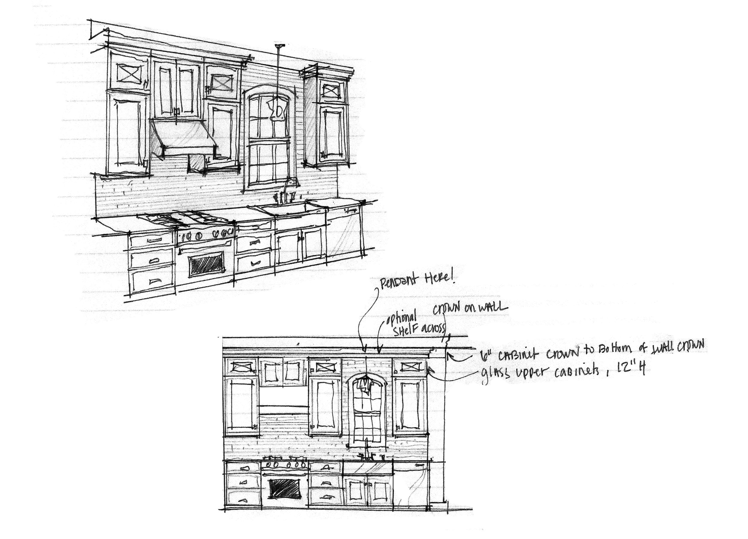
As you may remember, in an earlier post we shared the kitchen layout 'plan view' that was done in AutoCAD by Autodesk®. A plan view is a two-dimensional (2D) drawing that shows a section from the top - as if you're looking down into the kitchen.  These drawings are useful for communicating building instructions.

As part of the design process, those 2-D drawings of the kitchen layout were then used to create 3-D drawings and renderings. Below is a drawing done in 3-D. 

A 3-D sketch and an elevation drawing

A 3-D sketch and an elevation drawing

Taking this a step further, we then had the space created in a software called Chief Architect®. Having an image of the full whole room done in 3-D helps us to grasp the space, proportion, and flow of the kitchen and surrounding areas. 

A 3-D rendering of the kitchen

A 3-D rendering of the kitchen

While this image is extremely helpful for understanding the space, the software is limited in the types of materials that you display so we modified it once again in Adobe Photoshop to include the potential finishes, furniture, and accessories we have in mind. This image gets me closer to a realistic sense for the color, contrast, and style. It allows me to visualize how the selections relate to each other.

A 3-D rendering using specific finishes

A 3-D rendering using specific finishes

What a difference!  The styled rendering looks amazing. We can actually visualize ourselves in the space with this view AND appreciate the style of the space.

The flooring and cabinets are set, however, we are still working to find just the right lighting, furniture, backsplash, countertop, and fixtures.  Below are some details that we're considering.

lighting favorites.jpg

Idea-Tip.png
 

Mixing metal finishes is currently on-trend.  While mixing metals allows for a more interesting design, it is more challenging.  In order to be successful, it is important to consider the design principles repetition and balance.  The brass, black and nickle finishes are all being considered because the colors and finishes will be repeated in other elements of the room.  The color of the brass is being repeated in the art.  The nickel is being repeated in the stainless appliances.  The black is being repeated in the island stain color, door knobs, and hallway lighting.  Making sure the placement of those repeated finishes is balanced or placed evenly, ensures a successful design.


Our process continues as we sort through all of the options looking for the best combination. We look forward to sharing our final selections with you soon. 

The sketches and styled rendering were done by Angie's design collaborator, Lindsey.  The Chief Architect® rendering was done by Angie's design collaborator, Laura.  Angie loves her talented design team. 

Construction-Line.png
The front of the house is taking shape

The front of the house is taking shape

A view from the back.

A view from the back.

#8 Architectural Elevations

Back in post #4 we shared our daughter's house plan. If you squint really hard at this elevation drawing, you can see the porthole for the submarine she drew. Or, maybe it's just a really cool round window pouring light into our mudroom. 

It was extremely important to us that we had clean roof lines on our new home, we love good curb appeal. We used the dormers (windows projecting from the roof) over the garage and house to break up each roof and we used a barrel arch over our front door to create a unique entry area. We absolutely love how it looks.

Angie worked tirelessly with the architect to make sure that the top roof line of the house and the garage were at exactly the same height and, from the front of the house, the roof over the entry hides the roof over the screen porch. If you run a vertical line through the center of the garage or house, you have two equal halves. Symmetry is really important to our vision, as it adds a sense of order and feeling of ease. The outer design gives us some major curb appeal and we couldn't be happier with the view from the road! 

Front Elevation

Front Elevation

Rear Elevation

Rear Elevation

On the back side, we have an incredible view that stretches out over miles and miles. We needed to make sure that when an opportunity to sit back and relax presented itself, we could truly enjoy the view. The large windows and screen porch offer many spaces and opportunities to relish the endless view. 

Though it may seem obvious - We can't wait to get into this place!  Talking about it gets us excited, each and every time!

Happy new year to you and yours and here's to a fabulous 2018 for all of us!